Google Charts API provides options to generate a variety of charts like pie chart, column chart and more. Using this API it is easy to create the graphical reports for our charting application. In this article, we are going to see how to render attendance graph report using Google Chart API. In a previous tutorial, we have seen how to create charts using the Highcharts library.

In this example, I have used employee database to get the attendance data. This data collected from the database will be plotted on the graph created by using Google Charts API. The attendance graph will be shown in two type of charts pie chart and column chart.
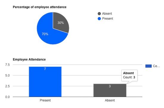
The pie chart will display the percentage of present and absent percentage of the employee. In the column chart, the employee attendance count will be shown instead of the percentage. I have used the custom colors to show the variation among the attendance data.
HTML to Render Attendance Graph with Google Charts
In this section, we will see the HTML landing page code of this chart example. In this example, the HTML code will be used for creating container tags as the target elements. These target element ident will be referred in the charting script. With this reference, the generated chart instance will be rendered on the HTML target container.
In this HTML page, the Google Chart API script will be loaded by using a Javascript includes. This API includes is the dependency for creating the Google visualization API instance. This instance will be used to create various type of Google charts based on the specification.
<!DOCTYPE html>
<html>
<head>
<meta name="viewport" content="width=device-width, initial-scale=1">
<title>How to Make Attendance Graph using Google Charts</title>
<style>
body {
    width: 660px;
    margin: 0 auto;
}
</style>
<script type="text/javascript"
    src="https://www.gstatic.com/charts/loader.js"></script>
<script type="text/javascript">
// API initialization to create Google chart
</script>
</head>
<body>
    <h1>How to Make Attendance Graph using Google Charts</h1>
    <div id="piechart"></div>
    <div id="columnchart"></div>
    </div>
</body>
</html>
Google Charts API Initialization Script
In this example, the pie and column charts are created to display the attendance report in a graphical format. The Google chart API is initialized to create the chart instance. While initializing the API chart instance, some default parameter has to be set as the options. For example, chart title, x-axis, y-axis captions, color and more. Previously, we have initialized chart instance with default options while generating dynamic data graph with Charts.js.
Pie Chart
Below script contains the code to set the header options title and custom colors for the pie chart slices. The color specification is optional. Without any color specification, the chart will be displayed with random colors chosen by default. The specifications and chart instances are sent as the parameters to draw the required chart.
In this code, the Google chart instance is created by calling the corresponding visualization classes. While creating this instance, the HTML target is specified as the parameter to render attendance graph. The attendance data collected from the database is passed to the visualization DataTables.
google.charts.load('current', {'packages':['corechart']});
google.charts.setOnLoadCallback(drawPieChart);

function drawPieChart()
{
    var pie = google.visualization.arrayToDataTable([
              ['attendancede', 'Numbder'],
              ['<?php echo $label[0]; ?>', <?php echo $count[0]; ?>],
              ['<?php echo $label[1]; ?>', <?php echo $count[1]; ?>],

         ]);
    var header = {
          title: 'Percentage of employee attendance',
          slices: {0: {color: '#666666'}, 1:{color: '#006EFF'}}
         };
    var piechart = new google.visualization.PieChart(document.getElementById('piechart'));
    piechart.draw(pie, header);
}
Column Chart
The script to draw the column chart will slightly be varied from that of the pie chart. The custom color codes for the columns are passed with the data instead of setting them with an options array. The column chart view object is created by calling the Google visualization DataView. The DataTable is passed to the chart view to plot the attendance data onto it.
google.charts.load('current', {packages: ['corechart', 'bar']});
google.charts.setOnLoadCallback(drawColumnChart);

function drawColumnChart() {
    var bar = google.visualization.arrayToDataTable([
           ['attendance','Count',{ role: "style" } ],
           ['<?php echo $label[1]; ?>', <?php echo $count[1]; ?>,"#006EFF"],
           ['<?php echo $label[0]; ?>', <?php echo $count[0]; ?>,"#666666"]
           ]);
    var columnview = new google.visualization.DataView(bar);
     columnview.setColumns([0, 1,
               { calc: "stringify",
                 sourceColumn: 1,
                 type: "string",
                 role: "annotation" },
               2]);
    var header = {
    title: 'Count of attendance',
    bar: {groupWidth: "50%"}
    };
    var barchart = new google.visualization.ColumnChart(document.getElementById("columnchart"));
    barchart.draw(columnview, header);
}
PHP Code to Get Attendance Data from the Database
Below PHP code creates the SELECT query to get the attendance data from the database. In this query, I have used MySQL case statements to get the attendance caption and count in a conditional basis. In the attendance database, 1, -1 represent the present and absent state of an employee.
The attendance aliasing name is used to get the caption and the present_absent_count is to get the attendance count. These data are formed in a PHP array format and loaded to the chart DataTable while initializing the chart instance to render attendance graph.
<?php
$connect = mysqli_connect("localhost", "root", "test", "blog_samples");
$query = "SELECT count(*) as present_absent_count, attendance,
     case
         when attendance = 1 then 'Present'
         when attendance = -1 then 'Absent'
       end as attendance FROM employee GROUP BY attendance ;";
$result = mysqli_query($connect, $query);
$i=0;
while ($row = mysqli_fetch_array($result)) {
    $label[$i] = $row["attendance"];
    $count[$i] = $row["present_absent_count"];
    $i++;
}
?>
MySQL Database Script
The following MySQL script containing the create statement and data for the employee table. It contains the employee information with attendance data.
--
-- Table structure for table `employee`
--

CREATE TABLE `employee` (
  `id` int(2) NOT NULL,
  `name` varchar(20) COLLATE latin1_bin NOT NULL,
  `gender` varchar(10) COLLATE latin1_bin NOT NULL,
  `attendance` tinyint(1) NOT NULL
) ENGINE=InnoDB DEFAULT CHARSET=latin1 COLLATE=latin1_bin;

--
-- Dumping data for table `employee`
--

INSERT INTO `employee` (`id`, `name`, `gender`, `attendance`) VALUES
(1, 'Regina Hollinshed', 'Male', 1),
(2, 'Catherine', 'Female', 1),
(3, 'Paul De Souza', 'Male', -1),
(4, 'Karolin', 'Female', -1),
(5, 'Infanta', 'Female', 1),
(6, 'David Milton', 'Male', 1),
(7, 'Imelda', 'Female', -1),
(8, 'Varghese', 'Male', 1),
(9, 'Greeda', 'Female', 1),
(10, 'Florence', 'Male', 1);

--
-- Indexes for dumped tables
--

--
-- Indexes for table `employee`
--
ALTER TABLE `employee`
  ADD PRIMARY KEY (`id`);
COMMIT;
Attendance Graph Output using Google charts
Below screenshot shows the employee attendance graph with the pie chart and column chart using Google Charts API. On hovering the chart slices and the column, the attendance info will be shown with a tooltip.


Hi. Regarding this code. Is it possible to use it for my own companies site or do I need to get a license, and if I do where can I get the license.
Thank you.
Hi Sanele,
All the code published in the blog articles are free. That includes this code which you are asking about.