Highcharts provides various types of beautiful chart components. It is helpful to present data in an interactive graphical representation. There are pie charts, bar charts, column charts, line charts, and many more formats.
It is a client-side chart component based on Javascript and can be easily implemented in our web projects.
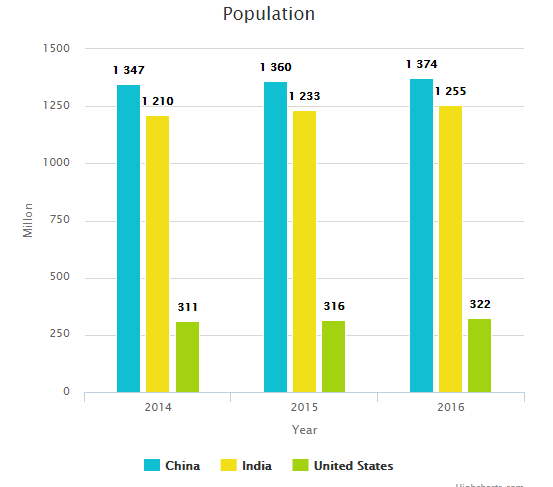
In this tutorial, let us assume an example scenario and see how to draw charts for them. Let’s compare the last three years’ census data of the world’s heavily populated countries. We will use Highcharts’ column chart to make this comparison.
First, let’s initialize the X-axis and Y-axis and other default options. After setting the required options, we assign the array of countries as a chart legend. Then, we push the census data to theHighcharts series option to draw the bar chart.
HTML to Render Chart
The following HTML has country checkboxes for the user to compare census data. The chart will be rendered onto a target DIV when clicking the compare button. This target DIV reference is set to the renderTo option.
<div class="chart-filter">
	<div class="chart-item-title">
	<input type="checkbox" name="countries" value="China" checked /> China
	<input type="checkbox" name="countries" value="India" class="chart-item-option" checked /> India
	<input type="checkbox" name="countries" value="United States" class="chart-item-option" /> United States
	</div>
	<input type="button" id="compare" value="Compare" class="btn-input" />
</div>
<div id="chart"></div>
Draw Column Chart using Highcharts
The following code sets some default options to draw the chart. Those are the chart type, title, height and width, X-axis and Y-axis, and more. We initialize the series option without any data.
var options = {
	chart: {
		 renderTo: 'chart',
		type: 'column',
		height: 500,
		width:530
	},
	title: {
		text: 'Population'
	},
	xAxis: {
		categories: [ '2014','2015','2016' ],
		title: { text: 'Year' }
	},
	yAxis: {
		min: 0,
		title: {
			text: 'Millon',
			align: 'middle'
		}
	},
	plotOptions: {
		column: {
			dataLabels: {
				enabled: true
			}
		}
	},
	series: [{},{},{}]
};
After initializing the series option, we must set data to these options. In the following code, we set the countries and their census rate to the series option’s name and data. Also, we set vivid colors for the columns.
// On click event handler to compare data
$("#compare").on("click",function(){
	var countries = ["China","India","United States"];
	var data = [[1347,1360,1374],[1210,1233,1255],[311,316,322]];
	var color = ["#10c0d2","#f1e019","#a2d210"];
	var selected_countries,j;

	// Clear previous data and reset series data
	for (i=0;i<data.length;i++) {
		options.series[i].name = "";
		options.series[i].data = "";
		options.series[i].color = "";
	}

	// Intializeseries data based on selected countries
	var i = 0;
	$("input[name='countries']:checked").each(function() {
		selected_countries = $(this).val();
		j = jQuery.inArray(selected_countries,countries)
		if(j >= 0){
		options.series[i].name = countries[j];
		options.series[i].data = data[j];
		options.series[i].color = color[j];
		i++;
		}

	});

	// Draw chart with options
	var chart = new Highcharts.Chart(options);

	// Display legend only for visible data.
	var item;
	for (k=i;k<=data.length;k++) {
		item= chart.series[k];
		if(item) {
			item.options.showInLegend = false;
			item.legendItem = null;
			chart.legend.destroyItem(item);
			chart.legend.render();
		}
	}

});