Responsive Datatables allows automatic column hiding based on the size of the viewport. The responsiveness can be added by specifying class=’responsive’ in the HTML or setting the responsive option as accurate while initializing Datatable.
The automatic column hiding will happen from the right by default. The rightmost columns will be hidden when the viewport width gets smaller. We can also customize to hide particular columns by defining responsive priority while initializing Datatables.
We can also use HTML5 data attribute data-priority to specify the custom priority of the columns.
In this tutorial, I have added examples for the responsive Datatables to customize column priority for automatic column hiding. These examples are used to see how to define column priority by using the columnDef option at the time of initialization and by using the HTML5 data-priority attribute.
In a previous tutorial, we have seen how to calculate the column-wise total using Datatables Footer callback.
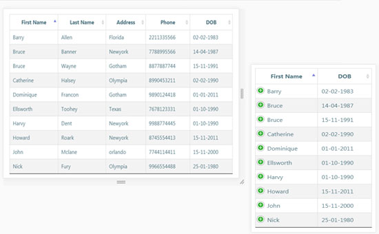
The following screenshot shows the output of this example.
Initializing Datatable with Responsive Column Priority
In this example, I used the columnDef property to specify the responsive priority of the Datatable columns. While initializing the Datatables, I specified the columns’ priority and target index.
The following script shows how to initialize a data table with automatic column hiding by setting responsive as accurate and defining column priority. This example has five columns: First Name, Last Name, Address, Phone, and DOB.
I set priorities 1 and 2 to the columns First Name and DOB, respectively. So, when the viewport size is small, the columns will be automatically hidden based on the priority set to the columns.
<script>
$(document).ready(function() {
    $('#contact-detail').dataTable({
		"responsive": true,
		"columnDefs": [
		            { responsivePriority: 1, targets: 0 },
		            { responsivePriority: 2, targets: 4 }
		        ]
    } );
} );
</script>
Customizing Column Priority using HTML5 Data Attribute
In this example, I used the HTML5 data-priority to specify the column priority with the Datatable HTML. In this code, I have added the class=responsive to let the Datatable be responsive in the smaller viewport.
I set the last two columns, Phone, and DOB, with priority 1 and 2, respectively.
<table id="contact-detail" class="responsive display nowrap" cellspacing="0" width="100%">
	<thead>
		<tr>
			<th>First Name</th>
			<th>Last Name</th>
			<th>Address</th>
			<th data-priority="1">Phone</th>
			<th data-priority="2">DOB</th>
		</tr>
	</thead>

	<tbody>
		<tr>
			<td>Barry</td>
			<td>Allen</td>
			<td>Florida</td>
			<td>2211335566</td>
			<td>02-02-1983</td>
		</tr>
		...
		...
		...
		<tr>
			<td>Tony</td>
			<td>Stark</td>
			<td>Texas</td>
			<td>8899886655</td>
			<td>05-10-1984</td>
		</tr>
	</tbody>
</table>


Thank you so much for your great sharing.
Welcome Ikeendi.