It is one of the free and best JS libraries for charts. It supports rendering more types of charts on the client side.
In this tutorial, we will see examples of rendering different types of line charts using the Chart.js library.
Quick example
The Chart JS library requires three things to be added to the webpage HTML to render the graph.
- Step 1: Include the Chart JS library file to the target HTML page.
- Step 2: Create an HTML canvas element to render the line chart.
- Step 3: Initiate the Chart JS library function with the data and other required options.
<canvas id="line-chart"></canvas>
<script
    src="https://cdn.jsdelivr.net/npm/chart.js@4.0.1/dist/chart.umd.min.js"></script>
<script>
	new Chart(document.getElementById("line-chart"), {
		type : 'line',
		data : {
			labels : [ 1500, 1600, 1700, 1750, 1800, 1850,
					1900, 1950, 1999, 2050 ],
			datasets : [
					{
						data : [ 186, 205, 1321, 1516, 2107,
								2191, 3133, 3221, 4783, 5478 ],
						label : "America",
						borderColor : "#3cba9f",
						fill : false
					}]
		},
		options : {
			title : {
				display : true,
				text : 'Chart JS Line Chart Example'
			}
		}
	});
</script>
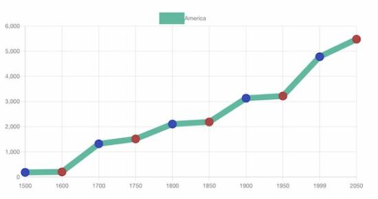
The script above refers to the target canvas element initiating the library class.
It pinpoints the graph readings with data properties. In addition, it specifies the line label and border color. This quick example will output the following line chart to the browser.
Output:
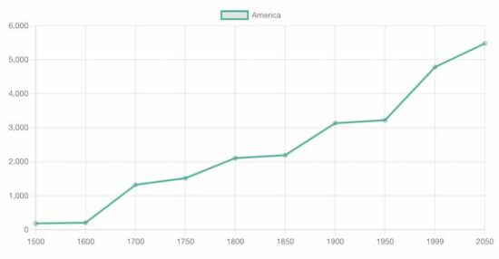
A line chart is the best way to display analytics as a catchy line graph. It also helps to compare one or more analytical lines.
In previous tutorials, we used different libraries to render different types of charts on a web page. See the below links if you want to refer.
More examples of line charts using Chart JS
The Chart JS supports creating various line charts to plot the different perspectives of the data points.
- It supports drawing multiple lines of data points in a line chart which shows data comparisons.
- It supports creating a linear line chart by applying x and y coordinates formulas.
- I render sin waves in a Chart JS line chart with JS Math functions.
In the below sections, we will see examples of creating the following type of line charts using the Chart JS library.
- Multiple lines in a line chart.
- Gridlines – Line chart
Chart JS Multiple Lines Example
It outputs a Chart JS graph with two line charts. The script sets the dataset array for the two lines displayed on the graph.
The dataset is configured with the following display properties apart from the data points of the line chart.
- label – to show with a tooltip on hovering a data point.
- borderColor – Line border color.
- fill – to enable or disable highlighting the chart area.
In this multi-line chart, the fill property is false since the two chart areas overlap.
<!DOCTYPE html>
<html>
<head>
<title>Chart JS Multiple Lines Example</title>
<link rel='stylesheet' href='style.css' type='text/css' />
</head>
<body>
    <div class="phppot-container">
        <h1>Chart JS Multiple Lines Example</h1>
        <div>
            <canvas id="line-chart"></canvas>
        </div>
    </div>
    <script
        src="https://cdn.jsdelivr.net/npm/chart.js@4.0.1/dist/chart.umd.min.js"></script>
    <script>
		new Chart(document.getElementById("line-chart"), {
			type : 'line',
			data : {
				labels : [ 1500, 1600, 1700, 1750, 1800, 1850,
						1900, 1950, 1999, 2050 ],
				datasets : [
						{
							data : [ 186, 205, 1321, 1516, 2107,
									2191, 3133, 3221, 4783, 5478 ],
							label : "America",
							borderColor : "#3cba9f",
							fill : false
						},
						{
							data : [ 1282, 1350, 2411, 2502, 2635,
									2809, 3947, 4402, 3700, 5267 ],
							label : "Europe",
							borderColor : "#e43202",
							fill : false
						} ]
			},
			options : {
				title : {
					display : true,
					text : 'Chart JS Multiple Lines Example'
				}
			}
		});
	</script>
</body>
</html>
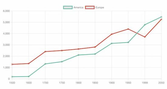
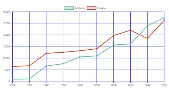
Chart JS Gridlines – Line Chart Example
This JS script configures the same settings as the above multi-line chart example. In addition, it configures the Chart JS scale properties to draw the grid in the x and y-axis.
The following display properties show the grid in both axes of the Chart JS graph.
- display – a boolean value to enable or disable grid display on the chart.
- color – the grid line border-color.
- lineWidth – the stroke size of the grid line.
<!DOCTYPE html>
<html>
<head>
<title>Chart JS Gridlines - Line Chart Example</title>
<link rel='stylesheet' href='style.css' type='text/css' />
</head>
<body>
    <div class="phppot-container">
        <h1>Chart JS Gridlines - Line Chart Example</h1>
        <div>
            <canvas id="line-chart"></canvas>
        </div>
    </div>
    <script
        src="https://cdn.jsdelivr.net/npm/chart.js@4.0.1/dist/chart.umd.min.js"></script>
    <script>
		new Chart(
				document.getElementById("line-chart"),
				{
					type : 'line',
					data : {
						labels : [ 1500, 1600, 1700, 1750, 1800,
								1850, 1900, 1950, 1999, 2050 ],
						datasets : [
								{
									data : [ 186, 205, 1321, 1516,
											2107, 2191, 3133, 3221,
											4783, 5478 ],
									label : "America",
									borderColor : "#3cba9f",
									fill : false
								},
								{
									data : [ 1282, 1350, 2411,
											2502, 2635, 2809, 3947,
											4402, 3700, 5267 ],
									label : "Europe",
									borderColor : "#e43202",
									fill : false
								} ]
					},
					options : {
						title : {
							display : true,
							text : 'Chart JS Gridlines - Line Chart Example'
						},
						scales : {
							x : {
								grid : {
									display : true,
									color: "#0046ff",
									lineWidth: 2
								}
							},
							y : {
								grid : {
									display : true,
									color: "#0046ff"
								}
							}
						}
					}
				});
	</script>
</body>
</html>
More details about the basics of the Chart JS library
Knowing more about this excellent JS library will help you use this graph confidently in production.
The default options will be applied without specifying dataset options or display properties. The following list shows the level of Chart.js options that will be resolved about the context. Read more about option resolution documentation provided by the Chart JS library.
Dataset and element properties for the data and options
- data.datasets[index] – options for this dataset only.
- options.datasets.line – options for all line datasets.
- options.elements.line – options for all line elements.
- options.elements.point – options for all point elements.
- options – options for the whole chart.
Display properties
- backgroundColor
- borderColor
- borderWidth
- fill
- hoverBorderColor
- label
- pointStyle
- xAxisID
- yAxisID
Custom options
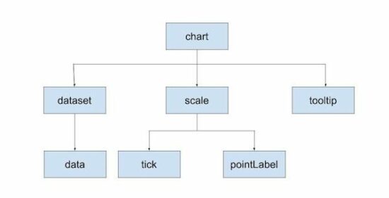
The Chart JS accepts a custom callback to be called on rendering each data point.
The callback function accepts the context reference to get the UI scope. The context hierarchy is shown in the below diagram.
Indexable options
Indexable options define properties for the chart.js data item at a particular index.
It has a mapping array to link a property at a particular index to the data point of the chart at the same index.
If the array options property array length is less than the data array, the property will be looped over.
The below code contains the options of setting line chart point color. It has only three pointBackgroundColor, in the array. It will loop over to the data array of 10 elements.
datasets : [{
	data : [ 186, 205, 1321, 1516, 2107,
			2191, 3133, 3221, 4783, 5478 ],
	label : "America",
	borderColor : "#3cba9f",
    pointBackgroundColor: [
        '#354abb',
        '#bb3c43'
    ],
    pointBorderColor: [
        '#354abb',
        '#bb3c43'
    ],
	fill: false,
    borderWidth: 12
}]
Other chart types supported by the Chart.js library
The Chart JS library also supports creating other types of charts listed below. Let us see the example of creating a few charts below in the future.
- Area chart
- Bar chart
- Bubble chart
- Doughnut chart
- Line chart
- Mixed chart
- Polar Area chart
- Radar chart
- Scatter chart