A gauge chart is a scale to measure performance amid the target. Yeah! My attempt at defining ‘Gauge.’ This article uses the ChartJS JavaScript library to create a gauge chat.
The below example creates a speedometer in the form of a gauge change. It achieves this with type=doughnut. The other options, cutout, rotation, and circumference, make the expected gauge chart view.
View Demo
Quick example
<!DOCTYPE html>
<html>

<head>
    <title>Gauge Chart Example using Chart.js</title>
    <script src="https://cdn.jsdelivr.net/npm/chart.js"></script>
</head>

<body>
    <canvas id="gaugeChart"></canvas>

    <script>
        // data for the gauge chart
        // you can supply your own values here
        // max is the Gauge's maximum value
        var data = {
            value: 200,
            max: 300,
            label: "Progress"
        };

        // Chart.js chart's configuration
        // We are using a Doughnut type chart to
        // get a Gauge format chart
        // This is approach is fine and actually flexible
        // to get beautiful Gauge charts out of it
        var config = {
            type: 'doughnut',
            data: {
                labels: [data.label],
                datasets: [{
                    data: [data.value, data.max - data.value],
                    backgroundColor: ['rgba(54, 162, 235, 0.8)', 'rgba(0, 0, 0, 0.1)'],
                    borderWidth: 0
                }]
            },
            options: {
                responsive: true,
                maintainAspectRatio: false,
                cutoutPercentage: 85,
                rotation: -90,
                circumference: 180,
                tooltips: {
                    enabled: false
                },
                legend: {
                    display: false
                },
                animation: {
                    animateRotate: true,
                    animateScale: false
                },
                title: {
                    display: true,
                    text: data.label,
                    fontSize: 16
                }
            }
        };

        // Create the chart
        var chartCtx = document.getElementById('gaugeChart').getContext('2d');
        var gaugeChart = new Chart(chartCtx, config);
    </script>
</body>

</html>
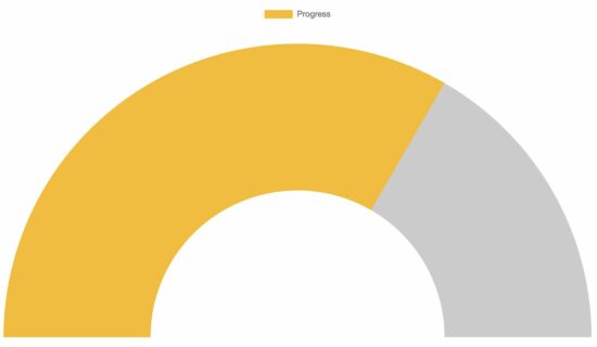
Steps to create a Gauge chart using the Chart JS library
The above quick example script follows the below steps to render a gauge chart with the data and the options.
- Import the Chart JS JavaScript library into the HTML. This example imports via CDN URL.
- Create an HTML canvas element.
- Prepare the gauge chart data and option array.
- Get the context of the canvas element.
- Initiate the ChartJS class with the context and the options array reference.
Many of the steps are similar to that of creating any other chart using this library. We have seen many examples in the ChartJS library. You can start with the ChartJS bar chart example if you are new to this JavaScript library.
About the data and the options array created for this example
The data and options are the main factors that change the chart view. This section has short notes for more information about the data and the options array created in JavaScript.
Data array
This JavaScript example uses an array of static data to form a gauge chart. You can supply dynamic data from the database or any external source instead.
The data array has the chart label, target, and current value. The target value is the maximum limit of the gauge chart scale. The current value is an achieved point to be marked.
Using these values, this script prepares the gauge chart dataset.
Options array
The options array is a configuration that affects the chart’s appearance.
The ChartJS allows featured configurations to experience the best chart views. Some of those options exclusive to the gauge chart are listed below.
- cutoutPercentage: The excluded portion from the gauge chart dial. While creating a doughnut chart, this option decides the inner surface area.
- rotation: It sets starting angle of the gauge chart arc.
- circumference: It decides the circumference of the arc.

