Representing data in a chart view is a huge subject in Mathematics and Computer Science. If you have the skill to transform raw numbers into a chart view, it’s a brilliant representation that makes users understand any complex data quickly.
Learning to build a chart in React will elevate your UI and make your application feel truly professional.
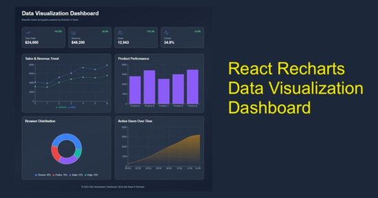
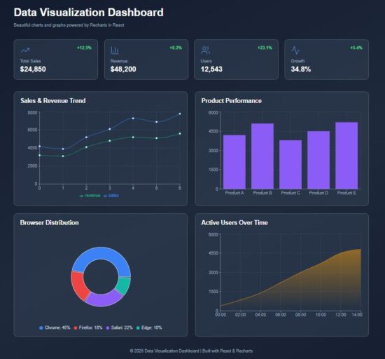
This React example includes dashboard visualization to display the following chart view.
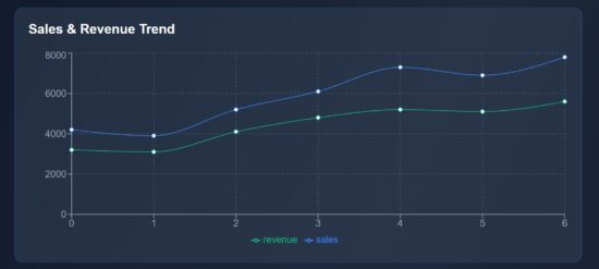
- Sales & revenue trend in the form of line chart.
- Product-wise performance using column chart.
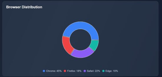
- Browser distribution in pie chart.
- Area chart to visualize users’ active time.
It uses Recharts library to show the raw data in a graph or chart form, as shown below.
Main React component containing chart components
The DataVisualization component manages React states and useEffect. It manages the separate state variables for each type of charts.
The React useEffect fetches the JSON data and set them to bind for the charts.
The chart UI are created as separate components and used in the dashboard wrapper.
src/components/DataVisualization.jsx
import { useState, useEffect } from "react";
import Header from "../components/Header";
import StatsCards from "../components/StatsCards";
import LineChartBox from "../components/LineChartBox";
import BarChartBox from "../components/BarChartBox";
import PieChartBox from "../components/PieChartBox";
import AreaChartBox from "../components/AreaChartBox";
import Footer from "../components/Footer";

const DataVisualization = () => {
  const [lineData, setLineData] = useState([]);
  const [barData, setBarData] = useState([]);
  const [pieData, setPieData] = useState([]);
  const [areaData, setAreaData] = useState([]);
  useEffect(() => {
    fetch("/data/dashboard.json")
      .then((res) => res.json())
      .then((data) => {
        setLineData(data.lineData);
        setBarData(data.barData);
        setPieData(data.pieData);
        setAreaData(data.areaData);
      })
      .catch((err) => console.error("Error loading data:", err));
  }, []);
  return (
    <div className="dashboard-wrapper">
      <div className="dashboard-container">
        <Header />
        <StatsCards />
        <div className="charts-grid">
          <LineChartBox data={lineData} />
          <BarChartBox data={barData} />
          <PieChartBox data={pieData} />
          <AreaChartBox data={areaData} />
        </div>
        <Footer />
      </div>
    </div>
  );
};
export default DataVisualization;
Chart visualization header with trending data cards
In this code, the chart components are created for rendering in a dashboard. Added to the chart representation, the dashboard shows cards to display trending data.
You can replace it with your applications progressive data in this cards. For demonstration purpose, they are all static data from the client-side. It’s a matter of minute to plug your dynamic data from the database.
src/components/Header.jsx
const Header = () => (
  <header className="dashboard-header">
    <h1>Data Visualization Dashboard</h1>
    <p>Beautiful charts and graphs powered by Recharts in React</p>
  </header>
);
export default Header;

src/components/StatsCards.jsx
import { TrendingUp, BarChart3, Users, Activity } from "lucide-react";
const StatsCards = () => {
  const stats = [
    { icon: <TrendingUp strokeWidth={1} />, label: "Total Sales", value: "$24,850", change: "+12.5%" },
    { icon: <BarChart3 strokeWidth={1} />, label: "Revenue", value: "$48,200", change: "+8.2%" },
    { icon: <Users strokeWidth={1} />, label: "Users", value: "12,543", change: "+23.1%" },
    { icon: <Activity strokeWidth={1} />, label: "Growth", value: "34.8%", change: "+5.4%" },
  ];
  return (
    <div className="stats-grid">
      {stats.map((stat, index) => (
        <div key={index} className="stat-card">
          <div className="stat-top">
            <span className="stat-icon">{stat.icon}</span>
            <span className="stat-change">{stat.change}</span>
          </div>

          <p className="stat-label">{stat.label}</p>
          <p className="stat-value">{stat.value}</p>
        </div>
      ))}
    </div>
  );
};
export default StatsCards;
Line chart to show the sales revenue graph
This script imports the Recharts component required for rendering a line chart. The following components are mostly required for all the charts.
- XAxis, YAxis
- Tooltip and Legend
- CartisanGrid
- ResponsiveContainer
The chart is rendered in a ResponsiveContainer block which support chart scaling based on the viewport size. The Tooltip and CartisanGrid will be shown on hovering the chart. The X,Y axis and chart legend are very usual part of the chart view.
The LineChart and Line components are exclusive to this type of chart. It accepts Recharts attributes to set the stroke width and color of the line graph.
src/components/LineChartBox.jsx
import { LineChart, Line, XAxis, YAxis, Tooltip, CartesianGrid, Legend, ResponsiveContainer } from "recharts";
const LineChartBox = ({ data }) => (
  <div className="chart-card">
    <h2>Sales & Revenue Trend</h2>
    <ResponsiveContainer width="100%" height={300}>
      <LineChart data={data}>
        <CartesianGrid strokeDasharray="3 3" stroke="#475569" />
        <XAxis stroke="#94a3b8" />
        <YAxis stroke="#94a3b8" />
        <Tooltip />
        <Legend />
        <Line type="monotone" dataKey="sales" stroke="#3b82f6" strokeWidth={1} />
        <Line type="monotone" dataKey="revenue" stroke="#10b981" strokeWidth={1} />
      </LineChart>
    </ResponsiveContainer>
  </div>
);
export default LineChartBox;
Bar chart fir showing performance graph
The BarChart and Bar component of the Recharts library are used in this script. The BarChart accepts chart data and Bar element requires the color specification to fill the column bar.
src/components/BarChartBox.jsx
import { BarChart, Bar, XAxis, YAxis, Tooltip, CartesianGrid, ResponsiveContainer } from "recharts";
const BarChartBox = ({ data }) => (
  <div className="chart-card">
    <h2>Product Performance</h2>
    <ResponsiveContainer width="100%" height={300}>
      <BarChart data={data}>
        <CartesianGrid strokeDasharray="3 3" stroke="#475569" />
        <XAxis dataKey="category" stroke="#94a3b8" />
        <YAxis stroke="#94a3b8" />
        <Tooltip />
        <Bar dataKey="value" fill="#8b5cf6" />
      </BarChart>
    </ResponsiveContainer>
  </div>
);
export default BarChartBox;
Pie chart – Recharts – showing browser distribution
This Recharts component accepts the inner-radius, outer-radius, cy, cx properties to draw the pie chart.
This chart type will have a Pie component which is to draw the pie wedges in the wrapper. The Cell is to draw each pie slices.
It receives the data and datakey in the <Pie /> component of this Recharts library.
src/components/PieChartBox.jsx
import { PieChart, Pie, Tooltip, ResponsiveContainer, Cell } from "recharts";
const PieChartBox = ({ data }) => (
  <div className="chart-card">
    <h2>Browser Distribution</h2>
    <ResponsiveContainer width="100%" height={300}>
      <PieChart>
        <Pie
          data={data}
          dataKey="value"
          innerRadius={60}
          outerRadius={100}
          paddingAngle={2}
          cx="50%"
          cy="50%"
        >
          {data.map((entry, i) => (
            <Cell key={i} fill={entry.color} />
          ))}
        </Pie>
        <Tooltip />
      </PieChart>
    </ResponsiveContainer>
    <div className="pie-legend">
      {data.map((item, i) => (
        <div key={i} className="legend-item">
          <span className="legend-color" style={{ background: item.color }} />
          <span>{item.name}: {item.value}%</span>
        </div>
      ))}
    </div>
  </div>
);
export default PieChartBox;
Area chart using the Recharts library
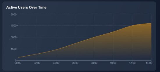
In this graph, it shows the active users count by time. It represents how many users are actively using your app at a particular point of time. It will help to monitor the spikes and drop in the traffic, product or services usages and more.
The AreaChart is the wrapper that contains the Area element which is to show the shaded part of the chart as shown below.
The JSON data contains the time and user count for each level of the graph. The area is highlighted within a LinearGadient definition.
src/components/AreaChartBox.jsx
import { AreaChart, Area, XAxis, YAxis, Tooltip, CartesianGrid, ResponsiveContainer } from "recharts";
const AreaChartBox = ({ data }) => (
  <div className="chart-card">
    <h2>Active Users Over Time</h2>
    <ResponsiveContainer width="100%" height={300}>
      <AreaChart data={data}>
        <defs>
          <linearGradient id="colorUsers" x1="0" y1="0" x2="0" y2="1">
            <stop offset="5%" stopColor="#f59e0b" stopOpacity={0.8} />
            <stop offset="95%" stopColor="#f59e0b" stopOpacity={0} />
          </linearGradient>
        </defs>
        <CartesianGrid strokeDasharray="3 3" stroke="#475569" />
        <XAxis dataKey="time" stroke="#94a3b8" />
        <YAxis stroke="#94a3b8" />
        <Tooltip />
        <Area
          type="monotone"
          dataKey="users"
          stroke="#f59e0b"
          fill="url(#colorUsers)"
        />
      </AreaChart>
    </ResponsiveContainer>
  </div>
);
export default AreaChartBox;
Conclusion
The React charts provide graphical view to understand your trending data. The line chart plots the performance range over time, the pie chart slices down browser distribution at a quick view, and the area chart visualizes the user activity patterns. By using Recharts responsive wrapper, each graph fit for different screen size. Overall, these charts transform raw numbers into visual stories to help efficient decision making.
References:

