A React Bootstrap dropdown component is to show a feature-rich dropdown menu.
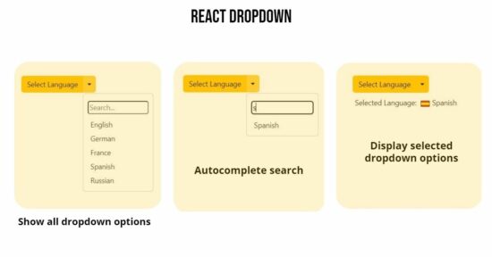
This article uses the React Bootstrap component to show a language dropdown. It is useful to display supported languages in a multi-lingual site. It has an auto-complete search feature that will facilitate shortlisting from a long list of options.
On choosing an option the UI will display a selected language with the corresponding flag icon. Flag or any iconic representation of site users’ region may make them feel personal.
The language dropdown supports users to easily change the languages dropdown menu. This article explains how to create a React component to show a Bootstrap dropdown to the browser. In a previous code, we have seen how to show a dropdown menu using the React Select and Dropdown component.
How to show a ‘languages known’ React dropdown?
These are the steps to integrate the React Bootstrap dropdown component to show selectable languages in a dropdown.
- Create a React App using
npx create-react-app react-bootstrap-dropdown. It needs to have thecreate-react-appinstalled. - Install Bootstrap and React Bootstrap libraries.
npm install react-bootstrap npm install bootstrap - Create JSX to return component design output.
- Create JavaScript handler functions to search and choose languages from the dropdown.
- Import the React Bootstrap autocomplete dropdown component and render it to the UI root container.

Create JSX for languages dropdown design
This JSX creates the React dropdown by using the Bootstrap <Dropdown><Dropdown.Item>... structure. This React Bootstrap component provides more features to let the dropdown design look good and efficient.
It uses Button with variant="warning" attribute to display the “Select Language” caption in the dropdown. It intimates the user interaction with this UI element.
The split property is set with the Dropdown.Toggle element to add a split button effect to the dropdown. This is to show a dropdown arrow on the right.
The Dropdown.Menu contains an input field above the options to shortlist the dropdown menu items.
src/App.js
return (
    <div className="phppot-container">
      <h1 className="mb-5">React Bootstrap Dropdown with AutoComplete Search</h1>
      <ButtonGroup>
        <Button variant="warning">Select Language</Button>
        <Dropdown as={ButtonGroup} onSelect={handleDropdownSelect}>
          <Dropdown.Toggle split variant="warning" className="custom-split-toggle" />
          <Dropdown.Menu className="custom-dropdown-menu">
            <input
              type="text"
              placeholder="Search..."
              onChange={(e) => setSearchTerm(e.target.value)}
              style={{ margin: "8px 10px", width: "calc(100% - 20px)", borderRadius: "5px" }}
            />
            {filteredOptions.map((language) => (
              <Dropdown.Item key={language} eventKey={language}>
                {language}
              </Dropdown.Item>
            ))}
          </Dropdown.Menu>
        </Dropdown>
      </ButtonGroup>
      {selectedItem && (
        <div style={{ marginTop: "10px", marginLeft: "5px" }}>
          <span style={{ marginRight: "5px" }}>Selected Language: </span>
          <img
            src={languageFlags[selectedItem]}
            alt={`${selectedItem} flag`}
            style={{ height: "20px", marginRight: "5px" }}
          />
          {selectedItem}
        </div>
      )}
    </div>
  );
};
export default App;
View to show the filtered language menu items in an auto-complete suggestion box.
The dropdown options are displayed by iterating the filteredOptions array. This component initiates an array of supported languages with a list of caption:2-char-code pairs. The filteredOptions array is set using the initial data based on the autocomplete search keyword.
The above JSX has a container to display the user-selected languages from the React dropdown. The output of this JSX is useful for a multi-language website to show an option to change languages.
Import libraries and create handler functions
This script is self-explanatory in that it imports the predominant React and React-Bootstrap libraries. It uses the Button, ButtonGroup, and the Dropdown from the React Bootstrap component.
The selected languages are shown with the corresponding flag in this example. The flags are the images that are imported at the beginning of the script below.
The useState for the users’ search keyword and selected option is managed with the proper setters. The JavaScript handlers are created to call these setters on searching dropdown options.
src/App.js
import { useState } from "react";
import { Button, ButtonGroup, Dropdown } from "react-bootstrap";
import "./form.css";
import "./style.css";
import ge from "./image/german.png";
import fr from "./image/france.png";
import es from "./image/spain.png";
import en from "./image/london.png";
import ru from "./image/russia.png";

const App = () => {
  const [selectedItem, setSelectedItem] = useState(null);
  const [searchTerm, setSearchTerm] = useState("");

  const languageFlags = {
    English: en,
    German: ge,
    France: fr,
    Spanish: es,
    Russian: ru,
  };

  const handleDropdownSelect = (eventKey, event) => {
    setSelectedItem(eventKey);
  };

  const filteredOptions = Object.keys(languageFlags).filter((language) =>
    language.toLowerCase().startsWith(searchTerm.toLowerCase())
  );
}
Render App function
Thus we have created a wonderful UI component with feature-packed Bootstrap Dropdown. The below JS code renders this component to the UI via ReactDom.
It imports the React App and Bootstrap CSS and loads the component to the browser. In a previous tutorial, we saw how to render a basic React file upload component to the UI.
src/index.js
import React from "react";
import ReactDOM from "react-dom/client";
import "bootstrap/dist/css/bootstrap.min.css";
import App from './App';

ReactDOM.createRoot(document.getElementById("root")).render(
  <React.StrictMode>
    <App />
  </React.StrictMode>
);
Where are the places a website can use the React Bootstrap dropdown component?
This article describes using the React Bootstrap dropdown component to show a language menu. Many web components are having a dropdown view for which this React solution will be suitable.
- Logged-in profile menu on the site header.
- List of payment methods, and modes in a shopping cart application.
- Country-state-city dropdown.
The React Bootstrap dropdown is a very good solution to make all the dropdown menus elegant and powerful to use.
More features are provided by the React Bootstrap dropdown component
This React component has more useful features. Some of them are listed below.
- It provides Single/split button dropdown variations. This example uses the split button UI.
- It inherits Bootstrap sizing, spacing, and theme color properties.
- It gives control to specify the sliding direction for the dropdown.
- It supports containing non-clickable text and header options in a DropdownButton container. It allows separate options with a
Dropdown.Divider. - It allows custom dropdown creation to have more control over the component.


Awesome
Thanks Mohanta.
The article was very informative. Thank you!
Welcome An
Thanks A Lot Vincy. Really Helpful, Keep Doing the Good Work
Welcome Vaibhav