The carousel is a sliding banner or tiles displaying catchy text or image content. It is mostly created for showcasing promotional content through the UI. It captures the end user’s attention with its modern animation effect.
This article has code with the ways of creating a modern 3d carousel using React. It uses three different React libraries to display a carousel component to the UI.
In this example, it gives navigation controls to move back and forth among the slides loaded to the 3d carousel component. In a previous tutorial, we have seen how to create an image carousel using jQuery.
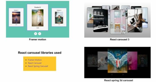
3D carousel libraries used for the React example
This example uses the below list of React libraries to achieve 3D carousel animation. These are the best-suited libraries to work with the latest React version.
- Framer motion
- React carousel3
- React spring 3d carousel
It gives ideal support for displaying promotional content on the UI to meet the following scenarios.
- It supports advertising trending posts.
- It helps promote best-selling products with an attractive carousel.
- It gives components to bring new highlights to user attention.
1. Framer Motion library
Install the Framer Motion library using this command. It is an open-source library to supports motion effects with a 3D carousel component for React.
npm install framer-motionThe below JavaScript exports the FramerMotionComponent to display a 3D carousel to the UI. The carousel displays a photo gallery with a motion effect. The previous, and next arrows ease the navigation to move the photos back and forth with the React slider.
This library class imports the AnimatePresence and motion instances. These imports make the carousel slides get in and move out smoothly from the UI during the animation.
The setActiveIndex manages the active slide and its direction of movement with the useState variables defined. The items = [...] array has the source of the gallery photos. The indexInArrayScope loops through the photos infinitely even though it reaches the last slide.
The visibleItems array contains the photos that should have visibility on the UI on switching the carousel slides. This example shows 3 photos on each click.
The variants array has the configurable options to enter, exit, and highlight a slide in the center while running the 3D carousal. It calls the getZIndex() to set the z-index property for each left, center, and right slide based on the direction.
src/components/framer-motion/framer-motion.js
import "./styles.css";
import { AnimatePresence, motion } from "framer-motion";
import { useState, useEffect } from "react";
import image1 from "./images/image1.jpg";
import image2 from "./images/image2.jpg";
import image3 from "./images/image3.jpg";

export default function App() {
  const [[activeIndex, direction], setActiveIndex] = useState([0, 0]);
  useEffect(() => {
    // Set the background color for the first page only
    document.body.style.backgroundColor = '#61c5b4';

    // Clean up the background color when the component is unmounted
    return () => {
      document.body.style.backgroundColor = '';
    };
  }, []);
  const items = [
    {
      title: "Product 1",
      image: image1,
      price: 10.99
    },
    {
      title: "Product 2",
      image: image2,
      price: 19.99
    },
    {
      title: "Product 3",
      image: image3,
      price: 14.99
    }
  ];

  // To run the carousel slides infinitely even though it reaches the last slide.
  const indexInArrayScope =
    ((activeIndex % items.length) + items.length) % items.length;

  // slicing the item array to display only have 3 items at a time
  const visibleItems = [...items, ...items].slice(
    indexInArrayScope,
    indexInArrayScope + 3
  );
  const handleClick = (newDirection) => {
    setActiveIndex((prevIndex) => [prevIndex[0] + newDirection, newDirection]);
  };

  return (
    <div className="main-wrapper">
      <div className="wrapper">
        {/*AnimatePresence is necessary to smoothen the items animation while entering and exiting the focus.*/}
        <AnimatePresence mode="popLayout" initial={false}>
          {visibleItems.map((item) => {
            return (
              <motion.div
                className="card"
                key={item.title}
                layout
                custom={{
                  direction,
                  position: () => {
                    if (item === visibleItems[0]) {
                      return "left";
                    } else if (item === visibleItems[1]) {
                      return "center";
                    } else {
                      return "right";
                    }
                  }
                }}
                variants={variants}
                initial="enter"
                animate="center"
                exit="exit"
                transition={{ duration: 1 }}
              >
                <h2>{item.title}</h2>
                <img src={item.image} alt="image_Link" />
                <p>{item.price}</p>
              </motion.div>
            );
          })}
        </AnimatePresence>
      </div>
      <div className="buttons">
        <motion.button
          whileTap={{ scale: 0.8 }}
          onClick={() => handleClick(-1)}
        >
          ◀︎
        </motion.button>
        <motion.button whileTap={{ scale: 0.8 }} onClick={() => handleClick(1)}>
          ▶︎
        </motion.button>
      </div>
    </div>
  );
}

const variants = {
  enter: ({ direction }) => {
    return { scale: 0.2, x: direction < 1 ? 50 : -50, opacity: 0 };
  },
  center: ({ position, direction }) => {
    return {
      scale: position() === "center" ? 1 : 0.7,
      x: 0,
      zIndex: getZIndex({ position, direction }),
      opacity: 1
    };
  },
  exit: ({ direction }) => {
    return { scale: 0.2, x: direction < 1 ? -50 : 50, opacity: 0 };
  }
};

function getZIndex({ position, direction }) {
  const indexes = {
    left: direction > 0 ? 2 : 1,
    center: 3,
    right: direction > 0 ? 1 : 2
  };
  return indexes[position()];
}
2. React carousel 3 library example
The following npm command lets the react-carousel-3 component be installed into a React app.
npm install react-carousel3This example has the carousal images locally in the React app’s public directory. The below program begins with importing the required image sources from the directory. You can also use multi-file upload options to supply the user-uploaded images to the carousel as its source.
It uses the Carousel instance of the react-carousel3 library class. It iterates over the image array and renders each image on the carousel slide container.
src/components/react-carousel/ReactCarouselComponent.js
import React from "react";
import { Carousel } from "react-carousel3";
import image1 from "./images/image1.jpg";
import image2 from "./images/image2.jpg";
import image3 from "./images/image3.jpg";
import image4 from "./images/image4.jpg";
import image5 from "./images/image5.jpg";
import image6 from "./images/image6.jpg";
import image7 from "./images/image7.jpg";
import image8 from "./images/image8.jpg";
import image9 from "./images/image9.jpg";
import image10 from "./images/image10.jpg";

const style = {
  width: 10,
  height: 30
};
const imgStyle = {
  padding: "2px",
  background: "black",
  borderRadius: "20px",
};
const images = [image1, image2, image3, image4, image5, image6, image7, image8, image9, image10];
export default function App() {
  return (

    <div
      style={{
        margin: "0px",
        padding: "0px",
        display: "flex",
        justifyContent: "center",
        background: "linear-gradient(to bottom,  white 0%, gray 100%)"
      }}
    >
      <Carousel
        height={"100vh"}
        width={700}
        yOrigin={0}
        xOrigin={0}
        yRadius={50}
        xRadius={600}
      >
        {images.map((image, index) => (
          <div key={index} style={style}>
            <img alt="" src={image} style={imgStyle} />
          </div>
        ))}
      </Carousel>
    </div>
  );
}
3. React Spring carousel library
It depends on the following two libraries specified in the npm installer commands. The react-spring-3d-carousel is the main library to achieve the 3D React carousel effect on the UI. And, the other is its dependency that is for making the output with smooth and interactive slides.
npm install react-spring-3d-carousel
and,
npm install react-spring
This example sets a unique key, JSX, and onClick handler name for each slide. The v4 as uuidv4 are used for generating unique keys. It sets the react-spring library’s configurable for setting the animation options.
The component name that returns the carousel JSX is ImageCarouselComponent as created for this example. It has the following vitals to discuss mainly. All are the state variables created for this 3D carousel example as listed below.
goToSlidedetermines the current active slide index or key.offsetRadiusadjusts the spacing between the carousel slides.showNavigationtoggles the navigation links visibility.enableSwipeenables/disables the swipe feature.configenriches the carousel effect by setting the animation speed.
The handleTouchStart or handleTouchMove handles the swipe event to navigate slides. The handleKeyDown enables navigation using the left and right arrow keys.
It maps the event listener based on the component mounting state with the componentDidMount and the componentWillUnmount callbacks.
src/components/artcards/ImageCarouselComponent.js
import React, { Component } from "react";
import Carousel from "react-spring-3d-carousel";
import { v4 as uuidv4 } from "uuid";
import { config } from "react-spring";
import image1 from "./images/image1.jpg";
import image2 from "./images/image2.jpg";
import image3 from "./images/image3.jpg";
import image4 from "./images/image4.jpg";
import image5 from "./images/image5.jpg";
import image6 from "./images/image6.jpg";
import image7 from "./images/image7.jpg";
import image8 from "./images/image8.jpg";

const getTouches = (evt) => {
  return (
    evt.touches || evt.originalEvent.touches // browser API
  );
};
const images = [image1, image2, image3, image4, image5, image6, image7, image8];

export default class ImageCarouselComponent extends Component {
  state = {
    goToSlide: 1,
    offsetRadius: 10,
    showNavigation: true,
    enableSwipe: true,
    config: config.slow
  };

  slides = images.map((image, index) => ({
    key: uuidv4(),
    content: <img src={image} alt={`${index + 1}`} />,
    onClick: () => this.setState({ goToSlide: index }),
  }));


  handleTouchStart = (evt) => {
    if (!this.state.enableSwipe) {
      return;
    }

    const firstTouch = getTouches(evt)[0];
    this.setState({
      ...this.state,
      xDown: firstTouch.clientX,
      yDown: firstTouch.clientY
    });
  };

  handleTouchMove = (evt) => {
    if (!this.state.enableSwipe || (!this.state.xDown && !this.state.yDown)) {
      return;
    }

    let xUp = evt.touches[0].clientX;
    let yUp = evt.touches[0].clientY;

    let xDiff = this.state.xDown - xUp;
    let yDiff = this.state.yDown - yUp;
    if (Math.abs(xDiff) > Math.abs(yDiff)) {
      if (xDiff > 0) {
        /* swipes left */
        this.setState({
          goToSlide: this.state.goToSlide + 1,
          xDown: null,
          yDown: null
        });
      } else {
        /* swipes right */
        this.setState({
          goToSlide: this.state.goToSlide - 1,
          xDown: null,
          yDown: null
        });
      }
    }
  };

  componentDidMount() {
    window.addEventListener("keydown", this.handleKeyDown);
  }

  componentWillUnmount() {
    window.removeEventListener("keydown", this.handleKeyDown);
  }

  handleKeyDown = (e) => {
    switch (e.keyCode) {
      case 37:
        this.setState({ goToSlide: this.state.goToSlide - 1 });
        break;
      case 39:
        this.setState({ goToSlide: this.state.goToSlide + 1 });
        break;
      default:
        break;
    }
  };

  render() {
    return (
      <div
        style={{ width: "80%", height: "500px", margin: "0 auto" }}
        onTouchStart={this.handleTouchStart}
        onTouchMove={this.handleTouchMove}
      >
        <Carousel
          slides={this.slides}
          goToSlide={this.state.goToSlide}
          offsetRadius={this.state.offsetRadius}
          showNavigation={this.state.showNavigation}
          animationConfig={this.state.config}
        />
      </div>
    );
  }
}
3D carousel example routing from the landing page
This React code is for showing 3 links in a landing page when running this example. This code contains the navigation menu to target the Route set with the path to render the appropriate 3D carousel.
npm install react-router-domImport the necessary React library components. Use the Router component from react-router-dom to set up the application’s routing.<
Create a navigation menu with links to different routes using the Link component.
Use the Routes and Route components to define the routes for the application. Each Route specifies a path and the corresponding component to render when that path is matched.
src/App.js
import React from 'react';
import { BrowserRouter as Router, Routes, Route, Link } from 'react-router-dom';
import FramerMotionComponent from './components/framer-motion/FramerMotionComponent';
import ReactCarouselComponent from './components/react-spring/ReactCarouselComponent';
import ReactSpringCarousel from './components/artcards/ReactSpringCarousel';
import "./style.css";

function App() {
    return (
        <Router>
            <nav>
                <ul>
                    <li><Link to="framer-motion-link">Framer Motion</Link></li>
                    <li><Link to="react-carousel-link">React Carousel</Link></li>
                    <li><Link to="react-spring-carousel-link">React Spring Carousel</Link></li>
                </ul>
            </nav>

            <Routes>
                <Route path="framer-motion-link" element={<FramerMotionComponent />} />
                <Route path="react-carousel-link" element={<ReactCarouselComponent />} />
                <Route path="react-spring-carousel-link" element={<ReactSpringCarousel />} />
            </Routes>
        </Router>
    );
}

export default App;


