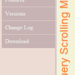
Usually, a menu bar occupies some spaces on a web page. Using a sliding menu gives us more space to display the main content. In previous posts, we have seen about jQuery menu expand and collapse with the sliding effect.
We call jQuery on the click event of the menu expand/collapse icon and control the sliding effect by using CSS styles. The sliding menu bar will be sticky on the page scroll in this example.
HTML Code for Sliding Menu
This code shows HTML for showing sliding menu items in the page. It has content interlinked with the menu items focused on the click event of the corresponding menu link.

<div>
	<div class="menu-list">
	<div id="close">X</div>
	<ul>
		<li class="menu-links" id ="about">About</li>
		<li class="menu-links" id ="photos">Photos</li>
		<li class="menu-links" id ="terms">Terms and Conditions</li>
		<li class="menu-links" id ="contact">Contact</a></li>

	</ul>
	</div>

	<div class="menu-link-target">
		<div id="expand-menu"><img src="menu.png" width="24px"/></div>
		<h4 id="about-content">About</h4>
		<p>It has survived...</p>
		<h4 id="photos-content">Photos</h4>
		<p>It is a long...</p>
		<h4 id="terms-content">Terms and Conditions</h4>
		<p>There are many variations...</p>
		<h4 id="contact-content">Contact</h4>
		<p>The standard chunk...</p>
	</div>
</div>
Sliding Sticky Menu Bar using jQuery
Sliding in and out effects are achieved by changing the absolute position of the sliding menu element using jQuery. The script is,
<script>
$("#expand-menu").on('click',function(){
    $(".menu-list").css( {"left": 0});
	$(".menu-link-target").css( {"left": 200});
	$("#expand-menu").hide();
});
$("#close").on('click',function(){
    $(".menu-list").css({"left": "-"+ $(".menu-list").width()});
	$(".menu-link-target").css( {"left": 0});
	$("#expand-menu").show();
});
$('.menu-links').click(function() {
		var target = $(this).attr('id');
		$('html, body').animate({scrollTop: $('#'+target+'-content').offset().top}, 1000);
});
</script>