Bootstrap inline property is for displaying the enclosed elements horizontally in a row. This property can be applied for any group like checkbox, radio and more.
This article describes how to apply the inline property to the form to display labels and inputs in a line. It creates examples by using the following methods.
- using Bootstrap form-inline class with version 4
- using Bootstrap grid system
There are scenarios in building a website to design inline form layouts. For example, the search form in the site header will mostly be inline. We will see some examples with the Bootstrap inline forms layout HTML that can be used in a website.
What is Bootstrap form inline?
Bootstrap form inline property is to display the form elements horizontally. It displays the labels, inputs and other form elements side by side in a row.
It is useful to show a one-line form wherever the UI needs to have a compact layout. For example, email subscription form, header search form and more.
The below quick example code will create a Bootstrap form inline appearance. It uses Bootstrap grid classes in the layout HTML.
This displays two fields, name and email in the same row. The labels are visually hidden by using the appropriate Bootstrap class. It uses Bootstrap row-cols-* classes to create a responsive form layout.
Quick Example
<form class="row row-cols-lg-auto g-3">
	<div class="col">
		<label class="visually-hidden" for="inline-form-name">Name</label> <input
			type="text" class="form-control" id="inline-form-name"
			placeholder="Name">
	</div>

	<div class="col">
		<label class="visually-hidden" for="inline-form-email">Email</label>
		<input type="text" class="form-control" id="inline-form-email"
			placeholder="Email">
	</div>


	<div class="col">
		<label class="visually-hidden" for="inline-form-website">website</label>
		<input type="text" class="form-control" id="inline-form-website"
			placeholder="Website">
	</div>

	<div class="col">
		<button type="submit" class="btn btn-primary">Submit Form</button>
	</div>
</form>
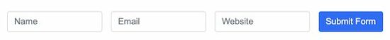
Output:
The following screen displays the Bootstrap form inline quick example output. It shows the three form fields in a single line side by side.
using Bootstrap form-inline class with version 4
The bootstrap form-inline class displays the enclosed form elements in a single line. This class is provided by Bootstrap 4 to render the inline form on a web page.
The below code shows HTML of the inline form layout. It uses Bootstrap form-inline and the spacing utilities to construct good looking form.
It builds a simple contact form layout with name, email, subject and message inputs. It uses Bootstrap 4 sr-only class to visually hide the labels.
Spacing is important in designing a Bootstrap inline form. Bootstrap provides various utilities to add sufficient spacing between the form elements.
- Margin utilities like m-*, mr-*.
- Padding utilities like p-*.
- Gutter modifier classes.
Below HTML form layout uses the margin utilities to the form group to add spacing.
examples/bootstrap-4-form-inline.html
<form class="form-inline" action="" method="post">
	<div class="form-group mr-2">
		<label class="sr-only" for="inputName">Name</label> <input
			type="text" class="form-control" id="inputName" placeholder="Name"
			required>
	</div>
	<div class="form-group mr-2">
		<label class="sr-only" for="inputEmail">Email</label> <input
			type="email" class="form-control" id="inputEmail"
			placeholder="Email" required>
	</div>
	<div class="form-group mr-2">
		<label class="sr-only" for="inputSubject">Subject</label> <input
			type="text" class="form-control" id="inputSubject"
			placeholder="Subject" required>
	</div>

	<div class="form-group mr-2">
		<label class="sr-only" for="inputMessage">Message</label> <input
			type="text" class="form-control" id="inputMessage"
			placeholder="Message" required>
	</div>
	<div class="form-group">
		<button type="submit" class="btn btn-primary">Send</button>
	</div>
</form>
Note: The Bootstrap form-inline displays only stacked elements in the mobile viewport.
Using Bootstrap grid system
Both the stacked and inline form have their own importance based on the requirements. But the form with stacked elements is common in many web pages.
Bootstrap provides classes to design complex forms differed from the usual layout. The Bootstrap grid system provides a CSS flexbox layout to have a series of columns in a row.
Below HTML uses the grid system classes to create a contact form. It uses row-cols-* and col-* to design a Bootstrap inline form with responsiveness.
inline-form-grid.html
<form class="row row-cols-lg-auto g-3">
	<div class="col-sm-2">
		<label for="inputName" class="visually-hidden">Name</label> <input
			type="text" class="form-control" id="inputName" placeholder="Name" />
	</div>
	<div class="col-sm-2">
		<label for="inputEmail" class="visually-hidden">Email</label> <input
			type="text" class="form-control" id="inputEmail"
			placeholder="Email" />
	</div>
	<div class="col-sm-2">
		<label for="inputSubject" class="visually-hidden">Subject</label> <input
			type="text" class="form-control" id="inputSubject"
			placeholder="Subject" />
	</div>
	<div class="col-sm-2">
		<label for="inputMessage" class="visually-hidden">Message</label> <input
			type="text" class="form-control" id="inputMessage"
			placeholder="Message" />
	</div>
	<div class="col-sm-2">
		<button type="submit" class="btn btn-primary">Send</button>
	</div>
</form>
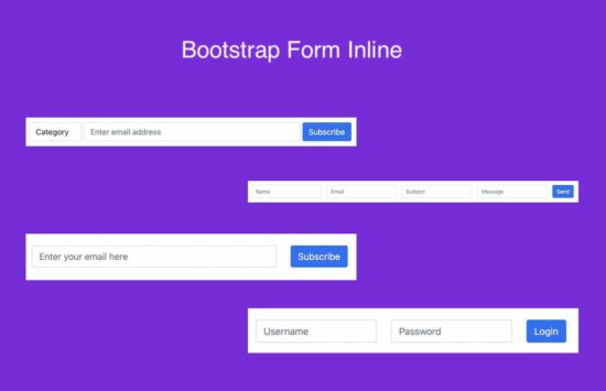
Both of the above HTML codes will create the same form layout. The following screenshot displays simple contact form fields in one line.
When designing Bootstrap inline forms, think about displaying labels along with the inputs. It may break the design sometimes if the form fields are more in numbers.
Since the below contact form includes 4 fields, the labels are visually hidden to have a clean layout.
Note:
- The form HTML must have the labels for the screen reading feasibility.
- You may have a Bootstrap inline form-group to have visible labels and inputs. It will give a good appearance with labels.
All the examples in this article include visually hidden labels and the inputs. The inputs contain the placeholder attribute to specify the field description.
Advantages of Bootstrap form inline
Forms with inline elements are one of the efficient ways of designing web forms. Why do we need to display Bootstrap inline forms? It must have some advantages. Let’s see some of them listed below.
- Compactness to save screen real estate.
- Simplicity to encourage people to interact.
- Fluidity on smaller screens by stacking inputs.
- A dependable grid component easily fits into the layout.
- Contains cross-browser support.
Bootstrap form inline in website
The below sections shows 3 example inline forms that are the most common components of a website.
- One-line header search form.
- Simple inline login form.
- Email subscription form.
All simulates the Bootstrap form-inline property with the grid system of this library.
One-line header search form
Header search is the most common part of the different types of web applications. For example, a shopping cart website, ticket booking system and more applications.
Most probably, the search will be a one-line UI component. Sometimes, we may see the Google-like advanced search utilities in web applications.
This layout displays combo search inputs to search for a keyword in a selected category. It contains a HTML dropdown for the category selection.
It uses rows-col-* with Gutter classes to display a responsive Bootstrap form inline. It sets the column spacing by the col-* classes.
header-search.html
<link
	href="https://cdn.jsdelivr.net/npm/bootstrap@5.0.2/dist/css/bootstrap.min.css"
	rel="stylesheet">

<link href="./../assets/css/style.css" rel="stylesheet" type="text/css">
...

<form class="row row-cols-lg-auto g-1">
	<div class="col-1">
		<label class="visually-hidden" for="inline-form-category">Category</label> <select
			class="form-control" id="inline-form-category">
			<option value="">Category</option>
			<option value="Toys">Toys</option>
			<option value="Books">Books</option>
			<option value="Stationaries">Stationaries</option>
			</select>
	</div>

	<div class="col-4">
		<label class="visually-hidden" for="inline-form-email">Email</label>
		<input type="text" class="form-control" id="inline-form-email"
			placeholder="Enter email address">
	</div>

	<div class="col">
		<button type="submit" class="btn btn-primary">Subscribe</button>
	</div>
</form>
Simple inline login form
In some rare website layouts, they have the one-line login form in the subheader. Why don’t take Facebook’s classic design as an example? It had an inline login form at the header.
Below Bootstrap login form HTML will output a one-line login layout for a web page. It displays the Username and the Password fields. You can insert Remember me option along with the layout to enhance it further.
One-line-login-form.html
<h1>Simple inline login form</h1>
<form>
	<div class="row">
		<div class="col-md-2">
			<label class="visually-hidden" for="inline-form-username">Username</label>
			<input type="text" class="form-control" placeholder="Username">
		</div>
		<div class="col-md-2">
			<label class="visually-hidden" for="inline-form-password">Password</label>
			<input type="password" class="form-control" placeholder="Password">
		</div>
		<div class="col">
			<button class="btn btn-primary
                  btn-block">Login</button>
		</div>
	</div>
</form>

Email subscription form
The email subscription form is an important component of a website. It converts the visitor to the subscribers of your website. It increases the reachability and helps to market your brand value.
It must be sleek and simple to encourage users to subscribe. So, Bootstrap form inline will be a good choice for creating this form layout.
If your website is not using Bootstrap, you may simulate the grid system flex layout by custom styles.
horizontal-subscription-form.html
<link
	href="https://cdn.jsdelivr.net/npm/bootstrap@5.0.2/dist/css/bootstrap.min.css"
	rel="stylesheet">

<link href="./../assets/css/style.css" rel="stylesheet" type="text/css">
<script
	src="https://cdn.jsdelivr.net/npm/bootstrap@5.0.2/dist/js/bootstrap.min.js"></script>
...
<h1>Simple inline login form</h1>
<form>
	<div class="row">
		<div class="col-4">
			<label class="visually-hidden" for="inline-form-email">Email</label>
			<input type="text" id="inline-form-email" class="form-control"
				placeholder="Enter your email here">
		</div>
		<div class="col">
			<button class="btn btn-primary
                btn-block">Subscribe</button>
		</div>
	</div>
</form>

Conclusion
Thus, we have seen how to create a Bootstrap inline form. We saw a quick example of designing inline forms with Bootstrap 5.
The list of advantages and examples forms emphasizes the real need of this property. The example with the .form-inline will help the people who are using Bootstrap 4.
The search, subscription form HTML give you the layout HTML to plugin to the application.