The Bootstrap navbar is a menu responsive header with navigation. Bootstrap supports enabling many UI effects with this navbar component. For example,
- Sticky navbar on scrolling the content.
- Slide-in effect by using Bootstrap expand-collapse
- Mobile-friendly responsive menu navigation.
This article is for creating a Bootstrap sticky navbar on the page top header. It shows both static and dynamic content on the navigation header. Let us see how to display a sticky navbar on a page using Bootstrap.
This quick example shows code to display the stick navbar. It includes Boostrap into the code by using CDN URL. You can also install Bootstrap via composer into your application vendor directory.
This example includes an expandable static header menu. It shows the sub-menu dropdown on clicking the main menu link.
It uses Bootstrap sticky-top to the .navbar element.
Quick Example
Include this into the HTML <head>
<link
	href="https://cdn.jsdelivr.net/npm/bootstrap@5.1.3/dist/css/bootstrap.min.css"
	rel="stylesheet">
<script
	src="https://cdn.jsdelivr.net/npm/bootstrap@5.1.3/dist/js/bootstrap.bundle.min.js"></script>
Put this Bootstrap sticky navbar into the <body>
<nav
	class="navbar navbar-expand-lg navbar navbar-expand-sm sticky-top navbar-dark bg-dark">
	<div class="collapse navbar-collapse" id="navbarSupportedContent">
		<ul class="navbar-nav mr-auto">
			<li class="nav-item active"><a class="nav-link" href="#">Home</a></li>
			<li class="nav-item active"><a class="nav-link" href="#">Contact</a>
			</li>
			<li class="nav-item active"><a class="nav-link" href="#">About</a>
		</ul>
	</div>
</nav>
Bootstrap navbar default behaviour
The below list shows the default behaviour of the Bootstrap navbar. This article features this UI component more by making it sticky on scrolling.
- Navbar is responsive by default in any viewport.
- It is hidden for printing but can be overridden by adding .d-print to the .navbar.
- It lets assistive mechanism to identify navbar by using <nav>. Bootstrap recommends to add role=”navigation” attribute for the <div> like containers.
Uses of Bootstrap sticky navbar
The Bootstrap sticky navbar provides a fixed header element mostly at the top. Sometimes, it will be used in the page and form footer.
The following list of items shows some of the uses of a sticky navbar in a website.
- To create a fixed header menu. Eg: The header menu links like ‘Contact’, ‘Request a quote’ will be useful if they are sticky on scroll.
- To create fixed footer links. Eg: The social media share option in the footer can be sticky to let the user to share the content at any time of reading.
- To keep a HTML form footer sticky on scroll. The payment form with the ‘Pay now’ or ‘Buy now’ control should be fixed regardless of the page scroll. It reduces friction and allows users to buy the product easily.
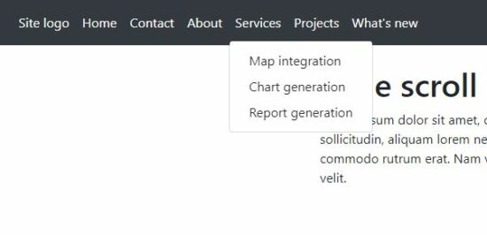
Bootstrap sicky navbar with static menu HTML
This code will help users having static websites who want to add a sticky navbar in the header.
bootstrap-sticky-navbar-static.php
<!DOCTYPE html>
<html>
<head>
<meta name="viewport" content="width=device-width, initial-scale=1">
<link
	href="https://cdn.jsdelivr.net/npm/bootstrap@5.1.3/dist/css/bootstrap.min.css"
	rel="stylesheet">
<script
	src="https://cdn.jsdelivr.net/npm/bootstrap@5.1.3/dist/js/bootstrap.bundle.min.js"></script>
</head>
<style>
.container {
    height: 1000px;
}
</style>
<body>
    <nav
        class="navbar navbar-expand-lg navbar navbar-expand-sm sticky-top navbar-dark bg-dark">
        <a class="navbar-brand" href="#">Site logo</a>
        <button class="navbar-toggler" type="button"
            data-toggle="collapse" data-target="#navbarSupportedContent"
            aria-controls="navbarSupportedContent" aria-expanded="false"
            aria-label="Toggle navigation">
            <span class="navbar-toggler-icon"></span>
        </button>
        <div class="collapse navbar-collapse"
            id="navbarSupportedContent">
            <ul class="navbar-nav mr-auto">
                <li class="nav-item active"><a class="nav-link" href="#">Home</a></li>
                <li class="nav-item active"><a class="nav-link" href="#">Contact</a>
                </li>
                <li class="nav-item active"><a class="nav-link" href="#">About</a>
                </li>
                <li class="nav-item dropdown active"><a
                    class="nav-link dropdown-toggle" href="#"
                    id="navbarDropdown" role="button"
                    data-toggle="dropdown" aria-haspopup="true"
                    aria-expanded="false"> Services </a>
                    <div class="dropdown-menu"
                        aria-labelledby="navbarDropdown">
                        <a class="dropdown-item" href="#">Map
                            integration</a> <a class="dropdown-item"
                            href="#">Chart generation</a> <a
                            class="dropdown-item" href="#">Report
                            generation </a>
                    </div></li>
                <li class="nav-item dropdown active"><a
                    class="nav-link dropdown-toggle" href="#"
                    id="navbarDropdown" role="button"
                    data-toggle="dropdown" aria-haspopup="true"
                    aria-expanded="false"> Projects </a>
                    <div class="dropdown-menu"
                        aria-labelledby="navbarDropdown">
                        <a class="dropdown-item" href="#"> Chat plugin</a>
                        <a class="dropdown-item" href="#">Form builder</a>

                    </div></li>
                <li class="nav-item active"><a class="nav-link disabled"
                    href="#">What's new</a></li>
            </ul>
            <form class="form-inline my-2 my-lg-0">
                <input class="form-control mr-sm-2" type="search"
                    placeholder="Search" aria-label="Search">
                <button class="btn btn-outline-success my-2 my-sm-0"
                    type="submit">Search</button>
            </form>
        </div>
    </nav>
    <div class="container">
        <div class="row">
            <div class="col-12 py-4">
                <h1>Page scroll content</h1>
                Lorem ipsum dolor sit amet, consectetur adipiscing elit.
                Praesent tincidunt dolor eget lorem blandit, auctor
                porttitor enim faucibus. Mauris sed elit sollicitudin,
                aliquam lorem nec, suscipit ex. Sed mollis rhoncus
                scelerisque. Morbi varius a est sed luctus. Morbi sapien
                velit, venenatis a sapien vitae, commodo rutrum erat.
                Nam volutpat diam ac convallis egestas. Nunc convallis
                tempor hendrerit. Aenean turpis quam, viverra eu eros
                quis, ornare tristique velit.
            </div>
        </div>
    </div>
</body>
</html>
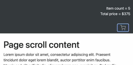
Bootstrap navbar with data-target link
In the bootstrap sticky navbar, it allows specifying the data target to expand.
In this example, the header navbar shows a cart icon on page load. The header HTML also contains the cart info hidden by default.
The navbar cart element targets this hidden cart info to expand it on the click event.
navbar-with-data-target.php
<!DOCTYPE html>
<html>
<head>
<meta name="viewport" content="width=device-width, initial-scale=1">
<link
	href="https://cdn.jsdelivr.net/npm/bootstrap@5.1.3/dist/css/bootstrap.min.css"
	rel="stylesheet">
<script
	src="https://cdn.jsdelivr.net/npm/bootstrap@5.1.3/dist/js/bootstrap.bundle.min.js"></script>
</head>
<style>
.container {
    height: 1000px;
}
</style>
<body>
    <div class="pos-f-t sticky-top">
        <div class="collapse " id="navbarToggleExternalContent">
            <div class="bg-dark p-4 text-right">
                <div class="text-light ">Item count = 5</div>
                <div class="text-light ">Total price = $375</div>
            </div>
        </div>

        <nav class="navbar navbar-dark bg-dark">
            <div class="col-lg-12">
                <button class="navbar-toggler float-right" type="button"
                    data-toggle="collapse"
                    data-target="#navbarToggleExternalContent"
                    aria-controls="navbarToggleExternalContent"
                    aria-expanded="false" aria-label="Toggle navigation">
                    <svg xmlns="http://www.w3.org/2000/svg" width="24"
                        height="24" viewBox="0 0 24 24" fill="none"
                        stroke="currentColor" stroke-width="2"
                        stroke-linecap="round" stroke-linejoin="round"
                        class="feather feather-shopping-cart">
                    <circle cx="9" cy="21" r="1"></circle>
                    <circle cx="20" cy="21" r="1"></circle>
                    <path
                            d="M1 1h4l2.68 13.39a2 2 0 0 0 2 1.61h9.72a2 2 0 0 0 2-1.61L23 6H6"></path></svg>
                </button>
            </div>
        </nav>

    </div>
    <div class="container">
        <div class="row">
            <div class="col-12 py-4">
                <h1>Page scroll content</h1>
                Lorem ipsum dolor sit amet, consectetur adipiscing elit.
                Praesent tincidunt dolor eget lorem blandit, auctor
                porttitor enim faucibus. Mauris sed elit sollicitudin,
                aliquam lorem nec, suscipit ex. Sed mollis rhoncus
                scelerisque. Morbi varius a est sed luctus. Morbi sapien
                velit, venenatis a sapien vitae, commodo rutrum erat.
                Nam volutpat diam ac convallis egestas. Nunc convallis
                tempor hendrerit. Aenean turpis quam, viverra eu eros
                quis, ornare tristique velit.
            </div>
        </div>
    </div>
</body>
</html>
The below screenshot cart icon and the expanded cart info. It displays the number of items in the cart and the total amount.
Dynamic menu in the sticky navbar
This example includes HTML as like as the static menu example. The difference is the menu items are from the database.
This code uses a PHP class DataSource.php to process the database operations. It uses MySqli with prepared-statement to access the database.
bootstrap-sticky-navbar-dynamic.php
<?php
namespace Phppot;

use Phppot\DataSource;
require_once __DIR__ . '/DataSource.php';
$conn = new DataSource();
$query = "SELECT * FROM tbl_menu where parent = 0";
$mainresult = $conn->select($query);
?>
<!DOCTYPE html>
<html>
<head>
<meta name="viewport" content="width=device-width, initial-scale=1">
<link
	href="https://cdn.jsdelivr.net/npm/bootstrap@5.1.3/dist/css/bootstrap.min.css"
	rel="stylesheet">
<script
	src="https://cdn.jsdelivr.net/npm/bootstrap@5.1.3/dist/js/bootstrap.bundle.min.js"></script>
</head>
<style>
.container {
    height: 1000px;
}
</style>
<body>
    <nav
        class="navbar navbar-expand-lg navbar navbar-expand-sm sticky-top navbar-dark bg-dark">

        <button class="navbar-toggler" type="button"
            data-toggle="collapse" data-target="#navbarSupportedContent"
            aria-controls="navbarSupportedContent" aria-expanded="false"
            aria-label="Toggle navigation">
            <span class="navbar-toggler-icon"></span>
        </button>
        <div class="collapse navbar-collapse"
            id="navbarSupportedContent">
            <ul class="navbar-nav mr-auto">

                <?php foreach ($mainresult as $key => $val){?>
                <li class="nav-item dropdown active"><a
                    class="nav-link " href="#" id="navbarDropdown"
                    role="button" data-toggle="dropdown"
                    aria-haspopup="true" aria-expanded="false"><?php echo $mainresult[$key]["menu_name"];?></a>
                    <?php

                    $query = "SELECT * FROM tbl_menu where parent= ?";
                    $paramType = "i";
                    $paramValue = array(
                        $mainresult[$key]["id"]
                    );
                    $subresult = $conn->select($query, $paramType, $paramValue);
                    ?>
                    <?php if (! empty($subresult)) {?>
                    <div class="dropdown-menu"
                        aria-labelledby="navbarDropdown">
                        <?php foreach ($subresult as $k => $v) {?>
                        <a class="dropdown-item" href="#"><?php echo $subresult[$k]["menu_name"];?></a>
                        <?php }?>
                    </div>
                    <?php
                    }
                }
                ?>
                </li>
            </ul>
            <form class="form-inline my-2 my-lg-0">
                <input class="form-control mr-sm-2" type="search"
                    placeholder="Search" aria-label="Search">
                <button class="btn btn-outline-success my-2 my-sm-0"
                    type="submit">Search</button>
            </form>
        </div>
    </nav>
    <div class="container">
        <div class="row">
            <div class="col-12 py-4">
                <h1>Page scroll content</h1>
                Lorem ipsum dolor sit amet, consectetur adipiscing elit.
                Praesent tincidunt dolor eget lorem blandit, auctor
                porttitor enim faucibus. Mauris sed elit sollicitudin,
                aliquam lorem nec, suscipit ex. Sed mollis rhoncus
                scelerisque. Morbi varius a est sed luctus. Morbi sapien
                velit, venenatis a sapien vitae, commodo rutrum erat.
                Nam volutpat diam ac convallis egestas. Nunc convallis
                tempor hendrerit. Aenean turpis quam, viverra eu eros
                quis, ornare tristique velit.
            </div>
        </div>
    </div>
</body>
</html>
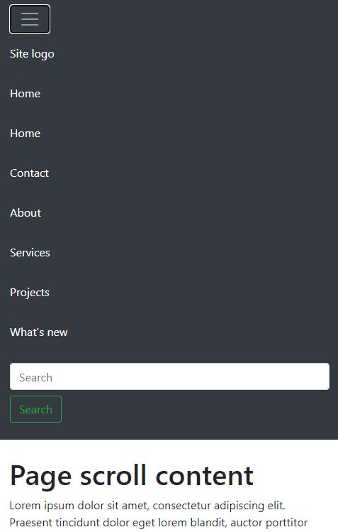
Responsive Bootstrap sticky navbar
Bootstrap navbar is responsive by default. In a mobile viewport, it displays a slide-down responsive menu. On clicking the menu-expand icon it drops down the menu items.
responsive-navbar.php
<?php
namespace Phppot;

use Phppot\DataSource;
require_once __DIR__ . '/DataSource.php';
$conn = new DataSource();
$query = "SELECT * FROM tbl_menu";
$result = $conn->select($query);
?>
<!DOCTYPE html>
<html>
<head>
<meta name="viewport" content="width=device-width, initial-scale=1">
<link
	href="https://cdn.jsdelivr.net/npm/bootstrap@5.1.3/dist/css/bootstrap.min.css"
	rel="stylesheet">
<script
	src="https://cdn.jsdelivr.net/npm/bootstrap@5.1.3/dist/js/bootstrap.bundle.min.js"></script>
</head>
<style>
.container {
	height: 1000px;
}
</style>
<body>
	<nav class="navbar navbar-expand-lg sticky-top navbar-dark bg-dark">
		<button class="navbar-toggler" type="button" data-toggle="collapse"
			data-target="#navbarTogglerDemo03"
			aria-controls="navbarTogglerDemo03" aria-expanded="false"
			aria-label="Toggle navigation">
			<span class="navbar-toggler-icon"></span>
		</button>
		<div class="collapse navbar-collapse" id="navbarTogglerDemo03">
			<ul class="navbar-nav mr-auto mt-2 mt-lg-0">
            <?php foreach ($result as $key => $val){?>
                <li class="nav-item active"><a class="nav-link" href="#"><?php echo $result[$key]["responsive_name"];?>
                         </li>
				</a><?php }?>

            </ul>
			<form class="form-inline my-2 my-lg-0">
				<input class="form-control mr-sm-2" type="search"
					placeholder="Search" aria-label="Search">
				<button class="btn btn-outline-success my-2 my-sm-0" type="submit">Search</button>
			</form>
		</div>
	</nav>
	<div class="container">
		<div class="row">
			<div class="col-12 py-4">
				<h1>Page scroll content</h1>
				Dolor sit amet, consectetur adipiscing elit.
			</div>
		</div>
	</div>
</body>
</html>
Database script
Import this database script to display a dynamic Bootstrap sticky navbar. It contains menu items and the parent-child relationship data.
database.sql
CREATE TABLE `tbl_menu` (
  `id` int(11) NOT NULL,
  `menu_name` text NOT NULL,
  `parent` varchar(255) NOT NULL
) ENGINE=InnoDB DEFAULT CHARSET=utf8mb4;

--
-- Dumping data for table `tbl_menu`
--

INSERT INTO `tbl_menu` (`id`, `menu_name`, `parent`) VALUES
(1, 'Site logo', '0'),
(2, 'Home', '0'),
(3, 'Contact', '0'),
(4, 'About', '0'),
(5, 'Services', '0'),
(8, 'Map integration', '5'),
(9, 'Chart generation', '5'),
(10, 'Report generation', '5'),
(11, 'Projects', '0'),
(12, 'Chat plugin', '11'),
(13, 'Form builder', '11'),
(14, 'What\'s new', '0');

--
-- Indexes for table `tbl_menu`
--
ALTER TABLE `tbl_menu`
  ADD PRIMARY KEY (`id`);


ALTER TABLE `tbl_menu`
  MODIFY `id` int(11) NOT NULL AUTO_INCREMENT, AUTO_INCREMENT=15;
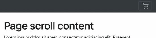
Bootstrap sticky navbar output