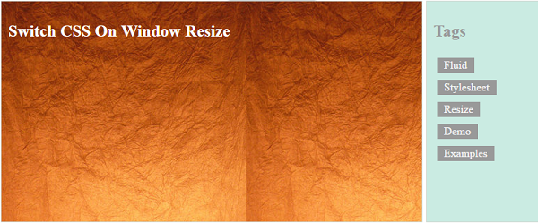
Here we are going to see an example to switch CSS file dynamically based on the window size. In this example code, we are having two CSS files. One is for the web and the other is for the mobile viewport.
We are having a jQuery function to switch CSS based on window size. This function will be executed on page load to load CSS for the current window size. It will be executed on the window resizing event also.
HTML Code with Two columns
In a previous post, we have seen about how to equate multiple column height dynamically. We are using the same template here for this CSS file switching example.

The code is
<div id="outer-div">
	<div id="inner-div">
	<H2>Switch CSS On Window Resize</H2>
	</div>
	<div id="menu-div">
	<H2>Tags</H2>
	<a class="demo-tag">Fluid</a>
	<a class="demo-tag">Stylesheet</a>
	<a class="demo-tag">Resize</a>
	<a class="demo-tag">Demo</a>
	<a class="demo-tag">Examples</a>
	</div>
</div>
jQuery Function to Switch CSS
This jQuery script will contain a function to switch CSS files based on the screen size. This function is invoked on the page load and the window resizing event. While invoking this function We are passing the window size. The script is,
<script>
	function switchCSS(windowsize) {
	  if (windowsize > 800) {
		$("#switchable").attr("href", "web.css");
	  } else {
		 $("#switchable").attr("href", "mobile.css");
	  }
	}

	$(document).ready(function() {
	  switchCSS($(this).width());

	  $(window).resize(function() {
		switchCSS($(this).width());
	  });
	});
</script>


