In HTML, we can add a title attribute for an element. The text specified in this attribute is shown as a tooltip on the mouse over the event. In this tutorial, we are going to create tooltips by using Bootstrap, it has good additional features over the standard tooltip.
We initialize the Bootstrap tooltip by referring to the element id selector with which the tooltip function should be triggered. In a previous tutorial, we have seen how to show form validation messages using the tooltip.
Bootstrap Tooltip library contains several options to customize the tooltip style, speed, content, and more. We can override the default options by setting them while calling the tooltip function.
In this example, I set the delay time for the animation effect and the title options with JavaScript. If no title attribute is specified or it is empty, then the title specified in JavaScript will be shown in the tooltip.
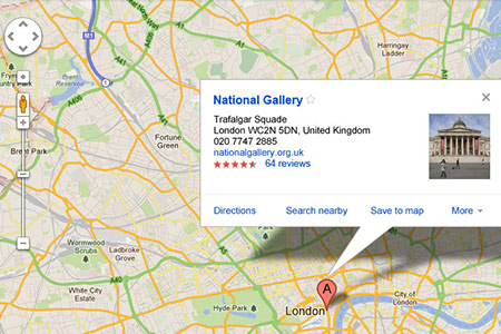
HTML Elements Triggers Tooltip
The code shows the HTML elements with which the tooltip library function is called on the mouse over event. It shows four DIV elements that trigger the tooltip on hover by specifying the tooltip placement location using the data attribute.
<div class="tooltip-buttons">
	<div class="btnTooltip" data-placement="top" title="Tooltip showing in the top position.">Top</div>
	<div class="btnTooltip" data-placement="right">Right</div>
	<div class="btnTooltip" data-placement="bottom">Bottom</div>
	<div class="btnTooltip" data-placement="left" title="Tooltip showing in the left position.">Left</div>
</div>
jQuery Script to call Bootstrap Tooltip
The following jQuery code shows how to trigger tooltips by specifying options as their arguments. I specify delay and default title if the element title is empty. The title option includes HTML content. HTML code is allowed in the tooltip if the option HTML is set as accurate.
<script type="text/javascript">
$(document).ready(function(){
    $('.btnTooltip').tooltip({
		delay: { "show": 500, "hide": 100 },
		title:"<strong class='txt-highlight'>Title is from the JavaScript</strong> as given as the Tooltip options.",
		html:true,
	});
});
</script>
The following table shows some more options for the tooltip library function and its default value.
| Option | Description | Default |
|---|---|---|
| animation | To add fade in / fade out effect to the tooltip popup. | true |
| container | To specify the element name within which the tooltip markup should be created dynamically to avoid overflow. | false |
| delay | To specify the time in milliseconds for the animation effect. | 0 |
| html | It has a boolean value to allow HTML code in the tooltip. | true |
| placement | It is to specify the position of the tooltip (top, right, bottom, left) | top |
| template | HTML template for the tooltip message. The title text will be included inside the div containing the class name tooltip-inner | ‘<div class=”tooltip” role=”tooltip”><div class=”tooltip-arrow”></div><div class=”tooltip-inner”></div></div>’ |
| title | It accepts text/HTML to be added in the tooltip popup. If the HTML is true, then the HTML code will be included. Otherwise, the HTML tags are stripped, and the text content is included in the tooltip. | ” |
| trigger | event methods like hover, focus, and manual to trigger the tooltip. It accepts multiple trigger events | ‘hover focus’ |
Output
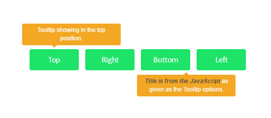
The following screenshot shows the tooltip popup for the element with the title attribute. It also shows the tooltip with the text specified in JavaScript for the element that does not has the title attribute.
Bootstrap.js
A quick introduction about bootstrap.js for those unaware: Bootstrap provides over a dozen custom jQuery plugins and complements Bootstrap’s components.
All those plugins are contained in bootstrap.js, or you can choose only those you require and get a customized download of bootstrap.js. Bootstrap’s jQuery plugins have jQuery and some other libraries.
Check the individual plugin documentation to know about them. In this tutorial, I have used the bootstrap.js plugin.

