Bootstrap is one of the leading frontend frameworks for building websites. It provides CSS and JavaScript bundles to design enriched UI components with little effort.
We will learn how to design Bootstrap cards in a website. The following code gives a quick example of creating Bootstrap cards design.
Quick Example
Displays Bootstrap cards with simple text and a button element.
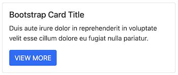
<div class="card">
    <!-- Bootstrap cards body displays title, description and a button -->
    <div class="card-body">
        <h5 class="card-title">Card title here</h5>
        <p class="card-text">Duis aute irure dolor in reprehenderit in
            voluptate velit esse cillum dolore eu fugiat nulla pariatur.</p>
        <div>
            <button type="button" class="btn btn-primary">VIEW MORE</button>
        </div>
    </div>
</div>
The bootstrap card is yet another container to hold text, images, buttons and more. This article includes examples to design Bootstrap cards with various types of content. For example, it shows,
- How to design and show list groups.
- How to design and show overlay content.
- How to design and show a card header and footer.
- How to customize Bootstrap cards design.
- How to show cards in grid.
Download Bootstrap library
I used Bootstrap 5 to design cards components for all the examples. Download the Bootstrap library from the linked official location.
It’s also available on GitHub to get the compiled Bootstrap CSS and JavaScript source. Also, it gives the commands to install Bootstrap via the package managers like npm or yarn.
Bootstrap cards design basics
The Bootstrap card view will have .card class in the outer container. The major components of a card are,
- .card-header
- .card-body
- card-footer
The .card-body exists in most of the cards to hold any type of content. The rest of the others are optional to be used on a need basis.
While designing cards we use the built-in classes for adding backgrounds. For example, .bg-info, .bg-warning and more. Refer to the Bootstrap color utility classes for more details.
Content type and Bootstrap class names related to card design
The below table maps the types of card content with the Bootstrap class names.
| Bootstrap class name | Types of card content |
|---|---|
| .card-title | Card heading |
| .card-text | Text description |
| .card-link | Hyperlink |
| .card-img, card-img-top, card-img-bottom | Images |
| .list-group, .list-group-item | For specifying list group container and items respectively. |
| .card-img-overlay | Display content on top |
| .card-columns, .card-deck | Display cards in a grid. The .card-deck displays cards with a uniform height. |
| .card-group | Display cards merged together. |
Cards container with Image
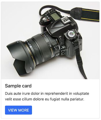
A HTML <img> tag with .card-img class will display image into the Bootstrap card. The below code displays image in the top with .card-img-top class name.
When you design an element add image to it carefully. If done correct, it will elevate the website to a better level, on the other side it may cost you performance wise on page load.
<div class="card">
    <img src="./images/camera.jpg" class="card-img-top">
    <div class="card-body">
        <h5 class="card-title">Sample card</h5>
        <p class="card-text">Duis aute irure dolor in reprehenderit in
            voluptate velit esse cillum dolore eu fugiat nulla pariatur.</p>
        <button type="button" class="btn btn-primary">VIEW MORE</button>
    </div>
</div>
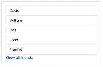
Design cards with list group and links
The below code designs a Bootstrap card with a list group. The outer container is with the .list-group class. Whereas the items are with .list-group-item inside the group.
<div class="card">
    <div class="card-body">
        <ul class="list-group">
            <li class="list-group-item">David</li>
            <li class="list-group-item">William</li>
            <li class="list-group-item">Doe</li>
            <li class="list-group-item">John</li>
            <li class="list-group-item">Francis</li>
        </ul>
        <a href="#" class="card-link">Show all friends</a>
    </div>
</div>
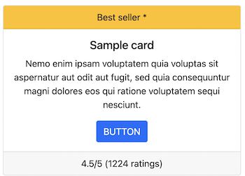
Bootstrap cards with header and footer
The header and footer in a Bootstrap card helps to tag something associated with the body content.
The below code designs card with a header and footer. The card header tags the tile with a “Best seller” mark. Similarly, the footer displays rating details with .card-footer class.
The shopping cart product tiles can use this to mark popular or best-selling products.
<div class="card">
    <-- Bootstrap cards header displays "Best seller tag -->
    <div class="card-header text-center bg-warning">
        <h6>Best seller *</h6>
    </div>
    <div class="card-body text-center">
        <h5 class="card-title">Sample card</h5>
        <p class="card-text">Nemo enim ipsam voluptatem quia voluptas
            sit aspernatur aut odit aut fugit, sed quia consequuntur
            magni dolores eos qui ratione voluptatem sequi nesciunt.</p>
        <button type="button" class="btn btn-primary">BUTTON</button>
    </div>
    <div class="card-footer text-center">
        <h6>4.5/5 (1224 ratings)</h6>
    </div>
</div>
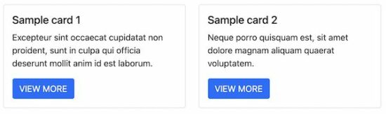
Bootstrap card design with ‘Sizing’ property
By default, the card containers are assumed to have the full width of the enclosing container. The Bootstrap allows having numbered-class utilities to specify the width of the container.
It helps to design a number of bootstrap cards in a grid view. Previously, we have seen how to design a shopping cart product gallery to display tiles in a grid.
<-- Displays two cards in a row by applying Bootstrap Sizing -->
<div class="col-sm-6">
    <div class="card">
        <div class="card-body">
            <h5 class="card-title">Sample card 1</h5>
            <p class="card-text">Excepteur sint occaecat cupidatat non
                proident, sunt in culpa qui officia deserunt mollit anim
                id est laborum.</p>
            <button type="button" class="btn btn-primary">VIEW MORE</button>
        </div>
    </div>
</div>
<div class="col-sm-6">
    <div class="card">
        <div class="card-body">
            <h5 class="card-title">Sample card 2</h5>
            <p class="card-text">Neque porro quisquam est, sit amet
                dolore magnam aliquam quaerat voluptatem.</p>
            <button type="button" class="btn btn-primary">VIEW MORE</button>
        </div>
    </div>
</div>
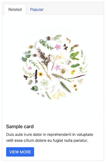
Add Navigation to Bootstrap card header
We have seen how to add a header to Bootstrap cards. The below code contains navigation tabs to the card header with .card-header-tabs class.
It contains a set of Bootstrap nav-item with nav-link. The navigation tabs are clickable and can be marked as selected.
<div class="card">
    <-- Bootstrap Card header shows navigation links-->
    <div class="card-header">
        <ul class="nav nav-tabs card-header-tabs">
            <li class="nav-item"><a class="nav-link active" href="#">Related</a></li>
            <li class="nav-item"><a class="nav-link" href="#">Popular</a></li>
        </ul>
    </div>
    <img src="./images/natural.jpg" class="card-img-top">
    <div class="card-body">
        <h5 class="card-title">Sample card</h5>
        <p class="card-text">Duis aute irure dolor in reprehenderit in
            voluptate velit esse cillum dolore eu fugiat nulla pariatur.</p>
        <button type="button" class="btn btn-primary">VIEW MORE</button>
    </div>
</div>
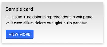
Add custom CSS to Bootstrap cards design
Though Bootstrap has CSS utilities, it supports adding custom CSS to design cards.
The below code designs a Bootstrap card with .custom-card class. It adds a gradient background to the design and a box-shadow as shown in the screenshot..
<-- custom-card selector added to map custom CSS --gt;
<div class="card custom-card bg-gradient-primary">
    <div class="card-body">
        <h5 class="card-title">Sample card</h5>
        <p class="card-text">Duis aute irure dolor in reprehenderit in
            voluptate velit esse cillum dolore eu fugiat nulla pariatur.</p>
        <button type="button" class="btn btn-primary">VIEW MORE</button>
    </div>
</div>
and the CSS style is,
.custom-card {
	box-shadow: 0 4px 8px 0 rgb(0 0 0 / 20%);
    background-image: linear-gradient(#d8d8d8, white);
}
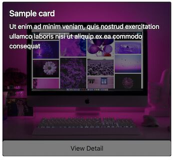
Show overlay on clicking cards
This example uses JavaScript to handle the hover event. The UI shows a Bootstrap card with an image.
The image element’s hover event triggers JavaScript to display the “View Detail” button.
On clicking the View Details button it shows the overlay content on top of the card image.
<div class="card bg-dark text-white">
    <img class="card-img overlay-img" onmouseover="showOverlayButton();"
        src="./images/computer.jpg" alt="Card image">
    <div class="card-img-overlay overlay-background d-none" id="image-overlay">
        <h5 class="card-title">Sample card</h5>
        <p class="card-text">Ut enim ad minim veniam, quis nostrud
            exercitation ullamco laboris nisi ut aliquip ex ea commodo
            consequat</p>
    </div>
    <button type="button" class="btn btn-light d-none"
        id="overlay-btn" onclick="showOverlay()">View Detail</button>
</div>
And the CSS is
.overlay-background {
	background: rgba(0,0,0, 0.5);
}
The below JavaScript has functions to toggle Bootstrap card overlay and button display.
function showOverlayButton() {
	var overlayButton = document.getElementById("overlay-btn");
	overlayButton.classList.remove("d-none");
}
function showOverlay() {
	var imageOverlay = document.getElementById("image-overlay");
	var overlayButton = document.getElementById("overlay-btn");
	imageOverlay.classList.remove("d-none");
	overlayButton.classList.add("d-none");
}
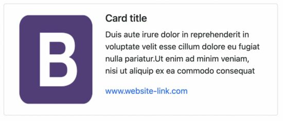
Bootstrap cards with horizontal content
This design shows Bootstrap cards in a visiting card-like look and feel. It displays content side-by-side in a horizontal direction.
<div class="card mb-3 max-width-540">
    <div class="row g-0">
        <div class="col-md-4">
            <img src="./images/bootstrap.png" class="card-image"
                alt="...">
        </div>
        <div class="col-md-8">
            <div class="card-body">
                <h5 class="card-title">Card title</h5>
                <p class="card-text">Duis aute irure dolor in
                    reprehenderit in voluptate velit esse cillum dolore
                    eu fugiat nulla pariatur.Ut enim ad minim veniam,
                    nisi ut aliquip ex ea commodo consequat</p>
                <a class="text-decoration-none" href="#">www.website-link.com</a>
            </div>
        </div>
    </div>
</div>
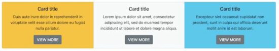
Create Bootstrap cards group
The .card-deck and .card-group class displays Bootstrap cards with uniform height. The difference is that the .card-group merges the cards together.
<div class="card-group">
    <div class="card text-center bg-warning">
        <div class="card-body">
            <h5 class="card-title">Card title 1</h5>
            <p class="card-text">Duis aute irure dolor in reprehenderit
                in voluptate velit esse cillum dolore eu fugiat nulla
                pariatur.</p>
            <button type="button" class="btn btn-secondary">VIEW MORE</button>
        </div>
    </div>
    <div class="card text-center bg-light">
        <div class="card-body">
            <h5 class="card-title">Card title 2</h5>
            <p class="card-text">Lorem ipsum dolor sit amet, consectetur
                adipiscing elit, sed do eiusmod tempor incididunt ut
                labore et dolore magna aliqua.</p>
            <button type="button" class="btn btn-secondary">VIEW MORE</button>
        </div>
    </div>
    <div class="card text-center bg-info">
        <div class="card-body">
            <h5 class="card-title">Card title 3</h5>
            <p class="card-text">Excepteur sint occaecat cupidatat non
                proident, sunt in culpa qui officia deserunt mollit anim
                id est laborum.</p>
            <button type="button" class="btn btn-secondary">VIEW MORE</button>
        </div>
    </div>
</div>
Bootstrap cards example files and download
Get the source code of the Bootstrap cards example we have seen above. It contains the Bootstrap library CSS and JavaScript with the application vendor directory.
Conclusion
We have seen a complete round of designing Bootstrap cards. We saw several examples to create various types of content in a card view.
The mapping table may help to relate the Bootstrap classes and the card design utilities.
I hope, this article gives you an elaborate coverage of Bootstrap card designing. Keep reading and share your thoughts via the comments section below.

I really like these examples! The mapping table is also a nice resource – thanks for sharing!
Thank you Andrew for the keen observation. Thank you for your support for Phppot.
thank you vincy greetings to you
Welcome Sehbani.
Nice mam
Thank you Dadtgir.