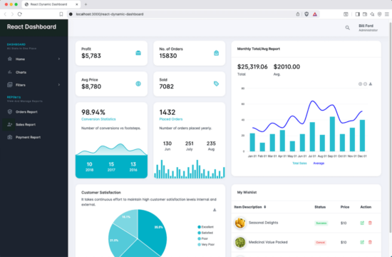
Application dashboard is a single point where the key statistics are rendered. This helps to have a quick glance on sensitive metrics with an application data.
In this React dashboard tutorial, we build UI with charts, cards and tabular views to display a few of the prime metrics. In this example, the dashboard is suitable for an eCommerce site and to gauge the pulse of the business.
The dashboard grid shows the following on a single page.
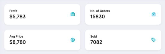
- Profit and conversion rate.
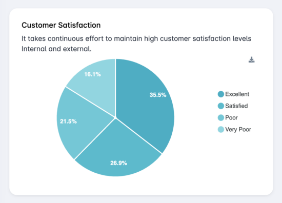
- Customer satisfaction graph.
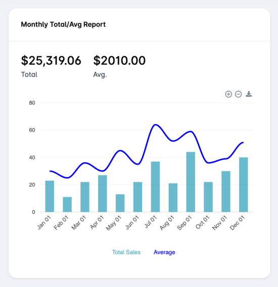
- Monthly sales report using a bar chart.
- Overall count of placed orders and products sold.
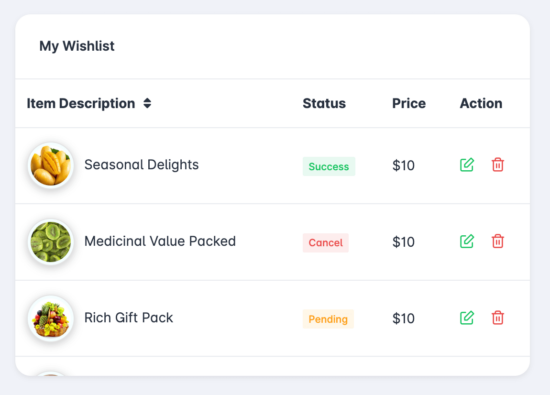
- Customer wishlist.
React admin dashboard components
In this React example, the dashboard is designed with structured layout. This admin dashboard layout contains few child component. Those are,
- Reusable Card widget with report reading.
- Chart component to render React Apexcharts.
- Widget to display tabular product wishlist.
- A common layout sidebar and header with React Bootstrap menu.
1. Reusable Card widget with report reading
The below React script shows a functional component named ProductCard. It returns <Card> element with the dynamic parameter passed to this component. It uses React-Bootstrap to create the card JSX.
It accepts parameters to get title, description, highlighting color and icon to show. These parameters are used to construct the card based on the report we want to show.
components/Widget/Statistics/ProductCard.jsx
import PropTypes from 'prop-types';
// react-bootstrap
import { Card, Row, Col } from 'react-bootstrap';

// -----------------------|| PRODUCT CARD ||-----------------------//

export default function ProductCard({ params }) {
  let cardClass = ['prod-p-card'];
  let iconClass = 'text-primary';
  let textClass = '';
  if (params.variant) {
    cardClass = [...cardClass, `bg-${params.variant}`];
    textClass = 'text-white';
    iconClass = 'text-white';
  }

  let rowClass = ['align-items-center'];
  if (params.secondaryText) {
    rowClass = [...rowClass, 'mb-4'];
  }

  return (
    <Card className={cardClass.join(' ')}>
      <Card.Body>
        <Row className={rowClass.join(' ')}>
          <Col>
            <h6 className={`m-b-5 ${textClass}`}>{params.title}</h6>
            <h3 className={`mb-0 ${textClass}`}>{params.primaryText}</h3>
          </Col>
          <Col sm="auto">
            <i className={`material-icons-two-tone ${iconClass}`}>{params.icon}</i>
          </Col>
        </Row>
        <p className={`mb-0 ${textClass}`}>{params.secondaryText}</p>
      </Card.Body>
    </Card>
  );
}

ProductCard.propTypes = { params: PropTypes.any };
This is the way to send the parameter to this ReactBootstrap card.
<ProductCard
  params={{
    title: 'Profit',
    primaryText: '$5,783',
    icon: 'card_giftcard',
    bgColor: '#6B4F9F', // dark lavender
    textColor: '#fff'
  }}
/>
2. Chart component to render React Apexcharts
React ApexChart Data Source for Monthly Sales Bar Chart
The SalesAccountChartData() function supplies series of data to build the bar chart. It shows the monthly report for the sales.
This object is with the options required for the React ApexChart. It sets the chart properties to export, zoom in and zoom out.
src/views/dasboard/DashCore/chart/sales-account-chart.js
export function SalesAccountChartData() {
  return {
    height: 350,
    type: 'line',
    options: {
      chart: {
        background: 'transparent',
        toolbar: {
          show: true,
          tools: {
            download: '<i class="fas fa-download"></i>',
            selection: false,
            zoom: false,
            zoomin: true,
            zoomout: true,
            pan: false,
            reset: false
          },
          export: {
            csv: false,
            svg: false,
            png: {
              filename: 'SalesAccountChart'
            }
          }
        }
      },
      stroke: {
        width: [0, 3],
        curve: 'smooth'
      },
      plotOptions: {
        bar: {
          columnWidth: '50%'
        }
      },
      colors: ['#01b0c6', '#0000FF'], // changed to middle lavender
      fill: {
        opacity: [0.85, 1]
      },
      labels: ['Jan 01', 'Feb 01', 'Mar 01', 'Apr 01', 'May 01', 'Jun 01', 'Jul 01', 'Aug 01', 'Sep 01', 'Oct 01', 'Nov 01', 'Dec 01'],
      markers: {
        size: 0
      },
      yaxis: {
        min: 0
      },
      grid: {
        strokeDashArray: 0,
        borderColor: '#f5f5f5'
      },
      tooltip: {
        shared: true,
        intersect: false,
        y: {
          formatter(y) {
            if (typeof y !== 'undefined') {
              return `$ ${y.toFixed(0)}`;
            }
            return y;
          }
        }
      },
      legend: {
        labels: {
          useSeriesColors: true
        },
        markers: {
          customHTML() {
            return '';
          }
        }
      },
      theme: {
        mode: 'light'
      }
    },
    series: [
      {
        name: 'Total Sales',
        type: 'column',
        data: [23, 11, 22, 27, 13, 22, 37, 21, 44, 22, 30, 40]
      },
      {
        name: 'Average',
        type: 'line',
        data: [30, 25, 36, 30, 45, 35, 64, 52, 59, 36, 39, 51]
      }
    ]
  };
}
Customer satisfaction (Pie)Chart Data Source
The below chart is rendered by sending the data reading and legend labels array. The object built using this functional component is passed to the React ApexChart.
src/views/dasboard/DashCore/chart/sales-customer-satisfication-chart.js
export function SalesCustomerSatisfactionChartData() {
  return {
    height: 260,
    type: 'pie',
    options: {
      chart: {
        background: 'transparent',
        toolbar: {
          show: true,
          tools: {
            download: '<i class="fas fa-download"></i>',
            selection: false,
            zoom: false,
            zoomin: false,
            zoomout: false,
            pan: false,
            reset: false
          },
          export: {
            csv: false,
            svg: false,
            png: {
              filename: 'SalesCustomerSatisfactionChart'
            }
          }
        }
      },
      labels: ['Excellent', 'Satisfied', 'Poor', 'Very Poor'],
      legend: {
        show: true,
        offsetY: 50
      },
      dataLabels: {
        enabled: true,
        dropShadow: {
          enabled: false
        }
      },
      theme: {
        mode: 'light',
        monochrome: {
          enabled: true,
          color: '#01b0c6' // lavender color
        }
      },
      responsive: [
        {
          breakpoint: 768,
          options: {
            chart: {
              height: 320
            },
            legend: {
              position: 'bottom',
              offsetY: 0
            }
          }
        }
      ]
    },
    series: [66, 50, 40, 30]
  };
}
3. Widget to display tabular product wishlist
This React example builds a component to display a tabular record. As like as the below table, it is sample to reuse the template code with different array of records.
components/Widgets/WishlistTable.jsx
import React, { useState } from "react";
import PropTypes from "prop-types";
import { Link } from "react-router-dom";

// react-bootstrap
import { Card, Table } from "react-bootstrap";

// project import
import SimpleBar from "simplebar-react";

// -----------------------|| PRODUCT TABLE ||-----------------------//

const WishlistTable = ({ wrapclass, title, height, tableheading, rowdata }) => {
  const [data, setData] = useState(rowdata);
  const [sortAsc, setSortAsc] = useState(true);

  // Sort by Item Name
  const handleSort = () => {
    const sorted = [...data].sort((a, b) => {
      if (a.name < b.name) return sortAsc ? -1 : 1;
      if (a.name > b.name) return sortAsc ? 1 : -1;
      return 0;
    });
    setData(sorted);
    setSortAsc(!sortAsc); // toggle ascending/descending
  };

  return (
    <Card className={wrapclass}>
      <Card.Header>
        <Card.Title as="h5">{title}</Card.Title>
      </Card.Header>
      <Card.Body className="p-0">
        <SimpleBar style={{ height }}>
          <Table responsive className="mb-0">
            <thead>
              <tr>
                {tableheading.map((x, i) => (
                  <th key={i} onClick={i === 0 ? handleSort : undefined} style={{ cursor: i === 0 ? "pointer" : "default" }}>
                    {x} {i === 0 && (
        <>
          {sortAsc && (
            <i className="fas fa-sort" style={{ marginLeft: "5px" }}></i>
          )}
          {!sortAsc && (
            <i className="fas fa-sort" style={{ marginLeft: "5px" }}></i>
          )}
        </>
      )}
                  </th>
                ))}
              </tr>
            </thead>
            <tbody>
              {data.map((y, j) => (
                <tr key={j}>
                  <td>{y.image}{y.name}</td>
                  <td>
                    <div>
                      <label className={`badge badge-${y.status.badge}`}>{y.status.label}</label>
                    </div>
                  </td>
                  <td>{y.price}</td>
                  <td>
                    {y.action.map((z, k) => (
                      <Link to={z.link} key={k}>
                        <i
                          className={`feather icon-${z.icon} f-16 text-${z.textcls} ${k > 0 ? "ms-3" : ""}`}
                          title="Action"
                        />
                      </Link>
                    ))}
                  </td>
                </tr>
              ))}
            </tbody>
          </Table>
        </SimpleBar>
      </Card.Body>
    </Card>
  );
};

WishlistTable.propTypes = {
  wrapclass: PropTypes.string,
  title: PropTypes.string,
  height: PropTypes.string,
  tableheading: PropTypes.array,
  rowdata: PropTypes.array
};

export default WishlistTable;
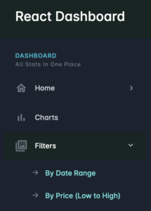
4. A common layout sidebar and header
The common header of this dashboard has the profile dropdown. This React dropdown menu has the options for linking routine profile pages.
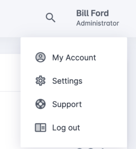
Also, the left sidebar shows menu group with expand/collapse submenu options.
React Bootstrap dashboard project’s main JSX
This main JSX code is the layout that contains all the dashboard components we have seen above.
It uses react Apexcharts for graphical and statistical visualization. This React tutorial build resusable card components and interactive charts.
This dashboard component is suitable for any eCommerce or sales management software. It is flexible to deploy and provides an statistical view with clean structured components.
src/views/dashboard/DashCore/index.jsx
// react-bootstrap
import { Row, Col, Card } from 'react-bootstrap';

// third-party
import Chart from 'react-apexcharts';

// project imports
import ProductCard from 'components/Widgets/Statistic/ProductCard';
import WishlistTable from 'components/Widgets/WishlistTable';
import { SalesCustomerSatisfactionChartData } from './chart/sales-customer-satisfication-chart';
import { SalesAccountChartData } from './chart/sales-account-chart';
import { SalesSupportChartData } from './chart/sales-support-chart';
import { SalesSupportChartData1 } from './chart/sales-support-chart1';
import WishlistData from 'data/wishlistTableData';

const DashCore = () => (
  <Row>
    <Col md={12} xl={6}>
      <Row>
        <Col sm={6}>
          <ProductCard
            params={{
              title: 'Profit',
              primaryText: '$5,783',
              icon: 'card_giftcard',
              bgColor: '#6B4F9F', // dark lavender
              textColor: '#fff'
            }}
          />
        </Col>
        <Col sm={6}>
          <ProductCard
            params={{
              title: 'No. of Orders',
              primaryText: '15830',
              icon: 'local_mall',
              bgColor: '#6B4F9F',
              textColor: '#fff'
            }}
          />
        </Col>
        <Col sm={6}>
          <ProductCard
            params={{
              title: 'Avg Price',
              primaryText: '$8,780',
              icon: 'monetization_on',
              bgColor: '#6B4F9F',
              textColor: '#fff'
            }}
          />
        </Col>
        <Col sm={6}>
          <ProductCard
            params={{
              title: 'Sold',
              primaryText: '7082',
              icon: 'local_offer',
              bgColor: '#6B4F9F',
              textColor: '#fff'
            }}
          />
        </Col>
      </Row>

      <Row>
        <Col md={6}>
          <Card className="support-bar overflow-hidden">
            <Card.Body className="pb-0">
              <h2 className="m-0">98.94%</h2>
              <span style={{ color: '#01b0c6' }}>Conversion Statistics</span>              <p className="mb-3 mt-3">Number of conversions vs footsteps.</p>
            </Card.Body>
            <Chart {...SalesSupportChartData()} />
            <Card.Footer
              className="border-0 text-white"
              style={{ backgroundColor: '#01b0c6' }}
            >
              <Row className="text-center">
                <Col><h4 className="m-0 text-white">10</h4><span>2018</span></Col>
                <Col><h4 className="m-0 text-white">15</h4><span>2017</span></Col>
                <Col><h4 className="m-0 text-white">13</h4><span>2016</span></Col>
              </Row>
            </Card.Footer>

          </Card>
        </Col>
        <Col md={6}>
          <Card className="support-bar overflow-hidden">
            <Card.Body className="pb-0">
              <h2 className="m-0">1432</h2>
              <span style={{ color: '#01b0c6' }}>Placed Orders</span>
              <p className="mb-3 mt-3">Number of orders placed yearly.</p>
            </Card.Body>
            <Card.Footer className="border-0">
              <Row className="text-center">
                <Col><h4 className="m-0">130</h4><span>Jun</span></Col>
                <Col><h4 className="m-0">251</h4><span>July</span></Col>
                <Col><h4 className="m-0 ">235</h4><span>Aug</span></Col>
              </Row>
            </Card.Footer>
            <Chart type="bar" {...SalesSupportChartData1()} />
          </Card>
        </Col>
      </Row>
    </Col>

    <Col md={12} xl={6}>
      <Card>
        <Card.Header><h5>Monthly Total/Avg Report</h5></Card.Header>
        <Card.Body>
          <Row className="pb-2">
            <div className="col-auto m-b-10">
              <h3 className="mb-1">$25,319.06</h3><span>Total</span>
            </div>
            <div className="col-auto m-b-10">
              <h3 className="mb-1">$2010.00</h3><span>Avg.</span>
            </div>
          </Row>
          <Chart {...SalesAccountChartData()} />
        </Card.Body>
      </Card>
    </Col>

    <Col md={12} xl={6}>
      <Card>
        <Card.Body>
          <h6>Customer Satisfaction</h6>
          <span>It takes continuous effort to maintain high customer satisfaction levels Internal and external.</span>
          <Row className="d-flex justify-content-center align-items-center">
            <Col>
              <Chart type="pie" {...SalesCustomerSatisfactionChartData()} />
            </Col>
          </Row>
        </Card.Body>
      </Card>


    </Col>

    <Col md={12} xl={6}>

      {/* Wishlist Tablular view */}
      <WishlistTable {...WishlistData} />
    </Col>
  </Row>
);

export default DashCore;
How to set up?
1) If you want to develop from the beginning, Start with running the these commands to create a new project.
npx create-react-app react-dynamic-dashboard

cd react-dynamic-dashboard

npm install

npm start
2) Otherwise, unzip the bundle given in the download and build the node_modules by running npm_install.
Note:
When running the the React pp, if you see any error, then run nvm use 20. This is to switch on the feasibility with latest node environment.
Conclusion
Thus, we have a React dashboard having minimal features in a clean and beautiful theme. The charts and graphs representation helps users to observe of data insights quickly. Also, the tabular views shortlists the most popular, or featured records among the volume of data. This dashboard can be expanded to have more cards with more features. A full-fledged dashboard have inline-filter, interactive charts and more advanced components. This basic version give a platform for more enhancements.
References: