eCommerce shopping cart software design is a highly underestimated work. The shopping cart software decides the fate of your online business model. It is the one that acts as the bridge between your customer and the business. It is a critical element in the life cycle of the online business model.
You might have a good products portfolio, unless it is showcased in an apt manner, the conversion will not be optimum. You may lose valuable customers due to a poorly designed eCommerce software. In a shopping cart software, the gallery page is an important page as it acts as the gateway to take the user to an item page.
The product gallery for shopping cart page is the first step in an online purchase cycle. A user browses through the product gallery, then chooses a product and goes into the detail. Then he makes the purchase. If the gallery design is not appropriate, the user will turn away in the first step itself.
With my extensive experience in working with eCommerce shopping cart software development, I found that the gallery page optimization is the first step in increasing your sales. This is part of a series of article that aims at sharing my knowledge in improving the online sales by optimizing the eCommerce software.

At the end of the line, is the smooth frictionless payment processing flow. Almost all the shopping cart software make poor design choices and cause a lot of friction in payment processing flow and which results in user dropout at the payment stage. We will see about it in detail and how to mitigate it in the coming article.
In this article, I have taken the top eCommerce (giants) and studied their gallery page which showcases the product portfolio in detail. I have recorded the specific metrics so that we can take a valuable point or two and get inspired by them.
- This study is completely based on a UI design point of view only.
- The viewport is based on a full-width desktop browser.
1. Items visible in the default viewport
Following is the number of items displayed in a single row in the shopping cart gallery page grid and a maximum number of rows visible in desktop view including the header.
- Amazon – 6 items per row and 2 rows view-able.
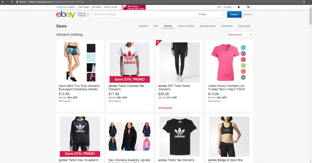
- EBay – 4 items per row and 2 rows view-able.
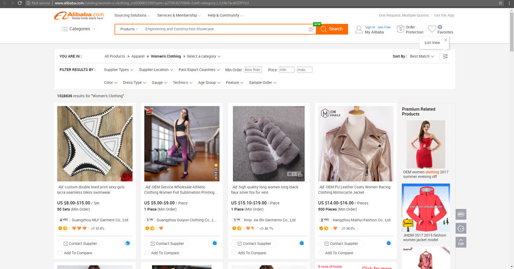
- Alibaba – 4 items per row and 1 row view-able.
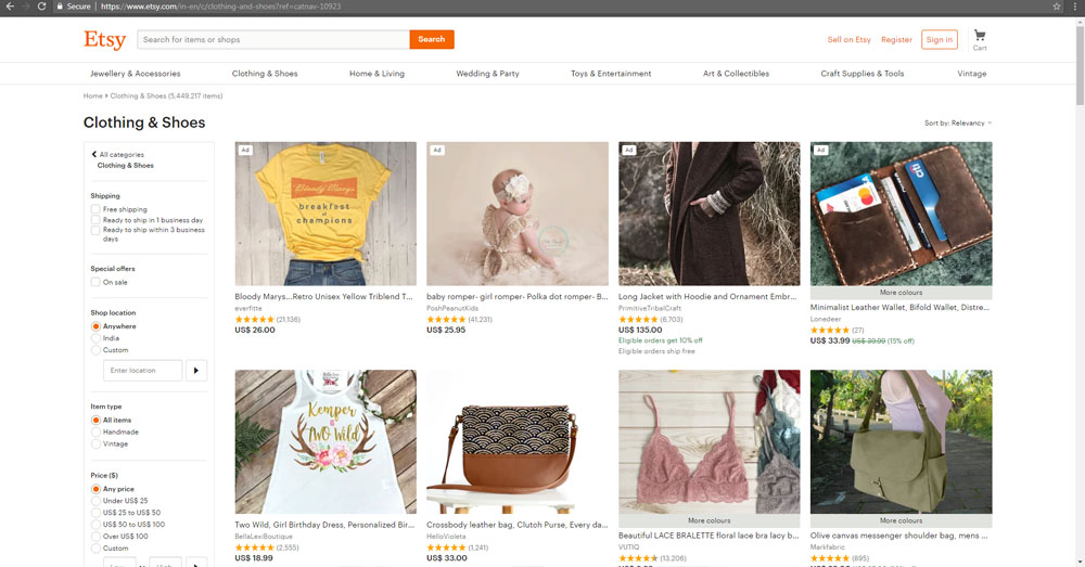
- Etzy – 4 items per row and 1 row view-able.
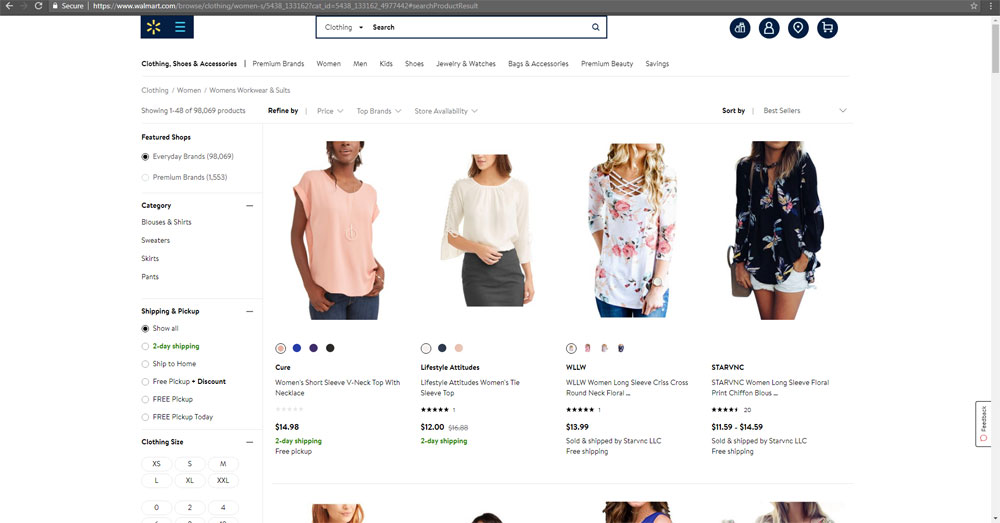
- Walmart – 4 items per row and 1 row view-able.
Amazon shows the maximum number of items in a single view of the browser. In total, we can see 12 items and other than Ebay, shows only 4 item in a single view without scroll. Amazon shows three times extra than their competitors. It is an important metric when it comes to a shopping cart software.
Amazon achieves it by giving a narrow design to the items and the overall content width is slightly larger in comparison. You should definitely consider this metric and attempt to show as much as a number of products in a single view.
2. The position of the filter in the gallery
- Amazon – Left sidebar.
- EBay – Topside, just below the header.
- Alibaba – Topside, just above the gallery.
- Etzy – Left sidebar.
- Walmart – Left sidebar.
This is an important interactive element that is related to the eCommerce software. In particular, when the portfolio is huge, the filter should be efficient in allowing the user to narrow down the choice as per their wish.
Filter should be in comfortable reach. The majority of the shopping cart software use the left sidebar to position the filter.
3. Individual shopping cart item display design
- Amazon – Box with four side borders.
- EBay – Box Type. Individual item has white background and page has a grey background.
- Alibaba – Box. Individual item has white background and page has a grey background.
- Etzy – Items spaced evenly in boxes. Box type but without any borders.
- Walmart – Open design, box type but without any borders. Every row has a bottom border.
Almost all of the shopping cart software use the verticle rectangle design. One thing is more common where there is a white background with no borders or almost invisible light colored borders.
I understand that this is to allow the eye to hop between items with less friction. If there are borders around the items in a grid, it may hinder the movement of your eyes between items.
4. Hover behavior on individual item
- Amazon – All the images of that particular product is shown one by one.
- EBay – No effects.
- Alibaba – Strong shadow around and the box gets highlighted. A left and a right icon pops up on item image and gives a feature to browse through the product images.
- Etzy – Product full title shown as tooltip and additionally a heart icon is shown to favorite that particular product.
- Walmart – No effects.
Amazon uses this hover action to showcase the images of the product as a gallery and Alibaba also does the same but it in a different manner. This is a nice idea for your eCommerce shopping cart software to implement.
5. Type of pagination for the gallery
- Amazon – Numbered pages list with a link.
- EBay – Show more link which on click pulls more items and populates in the bottom. Shopping cart gallery does not follow this same pattern in all category pages though.
- Alibaba – Numbered pages list with a link and an additional option to jump to any page number directly.
- Etzy – Numbered pages list with a link.
- Walmart – Numbered pages list with a link.
The majority uses a simple number list with a link to go to that page. I would recommend a load more option on a scroll to the bottom.
It is intuitive and easy to use. The latest redesign in Reddit does the same.
6. Information related to the item displayed
- Amazon – Title, price, and rating.
- EBay – Title, price with the offer, a link as ‘more options’ that leads to product’s page.
- Alibaba – Title, price, minimum order quantity, the seller (with age), seller rating, seller response rate, link to contact the supplier, link to chat and a feature to compare.
- Etzy – Title, price, rating, bestseller tagged and a link to see similar items.
- Walmart – Seller, title, rating, price, shipping and additional properties like color.
This is one area where we actually gamble in a shopping cart software design. The next step in the conversion process is to take the user to the product’s individual page.
None of the sellers have the ‘add to cart’ option the gallery page. If a user wants to buy, he needs to be taken to the individual page and then funnel him to the payment gateway process using PayPal or similar providers.
The information displayed here is critical to that step as it hooks the user to the next step. You do not want to overwhelm him with information and a crowded display will confuse the user and in turn exit the site.
Providing minimal information will make the user want to learn more. It will also give more space and not clutter the design and enable to display more products in a single view.
7. Overall Item Dimension
- Amazon – 269 x 433
- EBay – 290 x 441
- Alibaba – 305 x 582
- Etzy – 322 x 394
- Walmart – 280 x 692
The above numbers are in pixels (px). This is the size of an individual item. It is clearly visible that Amazon uses a narrow design.
It enables them to show the higher number of items in a single row and this is the option to emulate for us.
8. Main image preview geometry
- Amazon – Vertical rectangle image with dimension 176 x 232. 40832 pixels of the image shown.
- EBay – Square image with dimension 248 x 248. 61504 pixels of the image shown.
- Alibaba – Square image with dimension 281 x 281. 78961 pixels of the image shown.
- Etzy – Horizontal rectangle image with dimension 321 x 255. 81855 pixels of the image shown.
- Walmart – Vertical rectangle image with dimension 257 x 343. 88151 pixels of the image shown.
This is one important factor in eCommerce software gallery page design. How much large the image are you going to show in the product gallery.
It is directly proportional to the product dimension used. Amazon shows a smaller image in comparison. Amazon uses the space real estate carefully in all aspects as it determines the number of items shown in the gallery.
If you want to give a grand outlook, go the Walmart way as it shows more than double the size of Amazon.
9. Space between successive items in the gallery
- Amazon – 12 px
- EBay – 12 px
- Alibaba – 20 px
- Etzy – 18 px
- Walmart – 0
More the white space you add in your design, it will look clean and neat. 12px looks to be the optimum size which is a balance between have a decent space and also preserving the space.
10. Add to Cart button in gallery items
- Amazon – No.
- EBay – No.
- Alibaba – No.
- Etzy – No.
- Walmart – No.
I wanted to emphasize this point enough and so added this as an item. No matter how many times we repeat this point, a civilian seller is going to ask for this button.
In my extensive experience implementing eCommerce shopping cart software, every client insists on this. To make things worse, they will ask for an input field to enter the quantity to purchase directly from the gallery page.
No customer will buy a product just by seeing the title and price. He wants to know about what he is buying. Read the product details, preview its image gallery, zoom individual product image, rating, reviews, and more related information.
If he is going to buy it, he will visit the individual item page and then deliberate and go for the purchase. By having an ‘Add to Cart’ or ‘Buy Now’ button in the gallery itself, you are showing that you are desperate for a sale. This might send wrong signals to the user.
Conclusion
We need not design our own experience in an eCommerce shopping cart software. At least in the gallery page design. UI design is a long solved problem when it comes to the web. All we need to do is, emulate the best things from the front-runners and make minor changes to it and see what suits our domain. If you are looking for a PHP developer to develop a custom shopping cart using PHP, contact me.


GREAT CODE!!!
I am just learning PHP and you have been a great help!!! Your samples are great and every sample I download has been easy to get up and running without a single bug!!! Nice work!!
I created a server running apache, mysql and php to test all the code.
I am in the process of building a site that will scroll through a photo gallery while showing the image for a set time and then show the next in the scroll. However, my first major problem is that the image gallery could be 2000 photos. And the web page wants to load them all before starting the scroll. Trying to figure out how to make jquery load them behing the scenes to speed up page load…like streaming a video would do. Just brainstorming.
Again Thanks!!! And keep up the wonderful coding and helping others!!
Thank you so much for your kind words.
Hi Lee,
I am very happy about the PHP examples have been helpful for you.
Your photo gallery idea sounds great. For handling a large number of images, try lazy loading or progressive loading with AJAX. It will imporve the speed.
All the very best!