When we use DIV tags for an HTML view, then each independent DIV container will be shown upside down. If we want to display the DIV tags, then we need to apply styles to make each DIV float onto the page by specifying positions which might be absolute or relative or direction like left or right.
This article describes the required CSS styles to make a DIV element to be float with the specified position.
Float DIV to the Left
Let us arrange four DIV tags adjacent to one another by using the float property of CSS. And the code will be as follows.
<html>
<head>
<link rel="stylesheet" href="styles.css" type="text/css">
</head>
<body>
	<div>
		<div class="floatLeft">A</div>
		<div class="floatLeft">B</div>
		<div class="floatLeft">C</div>
		<div class="floatLeft">D</div>
	</div>
</body>
</html>
As shown in the above HTML content, each DIV container to be displayed in horizontal order is enclosed with an outer DIV. And then, for each inner DIV, the CSS class selector string is used by naming it as float left. For that selector, the required set of style properties are specified as,
.floatLeft {
	float: left;
	width: 30px;
	height: 30px;
	margin: 2px;
	background-color: #A4C739;
	text-align: center;
	line-height: 30px;
}
From the above properties of floatLeft selector string, the first property, that is, float:left is only the mandatory property to make DIV tags float in the left direction. Rather, the other subsequent properties are used to have a good look and feel.
Float DIV to Right
Similarly, by using insteadfloat:right of infloat:left csstCSSfile to be linked with the HTML content, we can make the above DIV tags float on the right corner of the outer DIV. So, a new class selector is used by naming it as floatRight, and the styles are,
.floatRight {
	float: right;
	...
	...
}
And then, we can use this class name inside the DIV class attribute, to float to the right end.
Clearing Float Property
CSS contains clear property, to cancel the applied float property to prevent its effect on the DIV containers to be displayed to the browser with a new line. This property is mainly used when we are required to display content in grid view using DIV tags.
Since the grid contains more number of rows and each row that includes more than one column, this clear property should be applied while starting each new row. And, this property is set with CSS as follows.
.clear {
	clear: both;
}
Example: CSS Float and Clear Properties
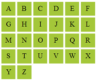
For example, we are going to display English alphabets in a row and column manner using DIV tags and float / clear properties. Let us have a constraint to display these alphabets with a maximum of 6 columns.
<html>
<head>
<link rel="stylesheet" href="styles.css" type="text/css">
</head>
<body>
<?php
$alphabets = array(
    "A",
    "B",
    "C",
    "D",
    "E",
    "F",
    "G",
    "H",
    "I",
    "J",
    "K",
    "L",
    "M",
    "N",
    "O",
    "P",
    "Q",
    "R",
    "S",
    "T",
    "U",
    "V",
    "W",
    "X",
    "Y",
    "Z"
);
$num_column = 6;
?>

<html>
<head>
<link rel="stylesheet" href="styles.css" type="text/css">
</head>
<body>
<?php
$array_length = count($alphabets);
for ($i = 0; $i < $array_length; $i ++) {
    ?>
<div>
<?php
    for ($j = $i; $j < $i + $num_column; $j ++) {
        if (! empty($alphabets[$j])) {
            if ($j % $num_column == 0)
                $clearFloat = "clear";
            ?>
<div class="<?php echo $clearFloat; ?> floatLeft"><?php echo $alphabets[$j]; ?></div>
<?php
            $clearFloat = "";
        }
    }
    $i = $j - 1;
    ?>
</div>
<?php
}
?>
</body>
</html>
In the above program, first, we have to initialize the alphabet array and the number of columns to be displayed for each row. And then, the length of the input array is calculated to set it as the limit for iterating using the outer for loop. The outer for loop is used to display each row and the inner for loop is used to display the column for each row.
When the row is going to end with the final column, then the class name to be used to clear the float styles set with this row DIVs is dynamically defined and embedded into HTML as the value of the DIV element’s class attribute.
Output
This program will display the alphabets in grid format having six-column for each row as shown in the below screenshot.


