This tutorial will show us how to create a responsive table with automatic column hiding. I used only HTML and CSS to hide columns responsively without third-party component dependencies like jQuery or DataTables.
In a previous tutorial, we have seen how to implement automatic column hiding using DataTables to display responsive tables. Check that out if you are using DataTables.
I used CSS class selectors to define the column priority as priority-1 and priority-2. The display styles are added to these class selectors based on the media screen size using CSS media queries.
When the window screen gets smaller, the display styles will be applied to the table columns based on the window size boundary specified in the media query.
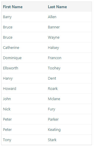
The following screenshots show the table columns in different screen sizes. The last three low-prioritized columns are hidden in the small window, showing only two columns.
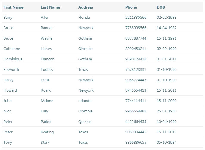
Column Priority Class in Responsive Table HTML
This HTML code is used to display responsive tables using the class selectors. I specified the priority to the HTML table columns to control the display based on the priority.
The column display will be hidden using the priority class selectors when the window size is smaller.
<table id="contact-detail" class="tutorial-table" cellspacing="0" width="100%">
	<thead>
		<tr>
			<th class="priority-1" width="15%">First Name</th>
			<th class="priority-2" width="15%">Last Name</th>
			<th class="priority-3" width="15%">Address</th>
			<th class="priority-4" width="10%">Phone</th>
			<th class="priority-5" width="15%">DOB</th>
		</tr>
	</thead>

	<tbody>
		<tr>
			<td class="priority-1">Barry</td>
			<td class="priority-2">Allen</td>
			<td class="priority-3">Florida</td>
			<td class="priority-4">2211335566</td>
			<td class="priority-5">02-02-1983</td>
		</tr>
		...
		...
		<tr>
			<td class="priority-1">Tony</td>
			<td class="priority-2">Stark</td>
			<td class="priority-3">Texas</td>
			<td class="priority-4">8899886655</td>
			<td class="priority-5">05-10-1984</td>
		</tr>
	</tbody>
</table>
CSS Media Queries for Automatic Column Hiding
The following CSS code implements automatic column hiding using media queries. This code contains media queries for four various window screens by specifying the min-max boundaries.
The corresponding display style will be applied to the table columns when the window size falls into the boundary.
@media screen and (max-width: 1225px) and (min-width: 1045px) {
		.priority-5{
			display:none;
		}
	}

	@media screen and (max-width: 1045px) and (min-width: 835px) {
		.priority-5{
			display:none;
		}
		.priority-4{
			display:none;
		}
	}

	@media screen and (max-width: 565px) and (min-width: 300px) {
		.priority-5{
			display:none;
		}
		.priority-4{
			display:none;
		}
		.priority-3{
			display:none;
		}
	}

	@media screen and (max-width: 300px) {
		.priority-5{
			display:none;
		}
		.priority-4{
			display:none;
		}
		.priority-3{
			display:none;
		}
		.priority-2{
			display:none;
		}

	}


Wowzer! Beautifully simple, effective take on tables.
The of priority so really cool.
Thanks for the article Vincy
Welcome Pieter.
Legend, really helped it stick in my head just how to use media queries! Thank you
Welcome!