A layout can look perfect on a wide monitor and turn into a small horizontal-scrolling disaster the moment someone opens it on a phone. Responsive web design prevents that by letting content adapt to the space available instead of assuming one fixed screen size.
The modern approach is simpler than maintaining separate desktop and mobile pages. Start with a usable narrow layout, use flexible CSS, and introduce a breakpoint only when the content needs a different arrangement.
What is responsive web design?
Responsive web design is an approach in which one HTML document adapts to different viewport and container sizes. It combines flexible layouts, responsive media, and CSS rules that respond to available space.
A practical responsive page usually includes:
- A viewport meta tag for correct mobile rendering.
- Mobile-first base styles that work without a media query.
- Flexible layouts built with CSS Grid or Flexbox.
- Images and other media that stay within their containers.
- Breakpoints chosen according to the content, not a list of device models.
HTML is naturally fluid. Problems usually begin when CSS adds fixed widths, inflexible columns, or media that is wider than the viewport. Responsive design keeps that useful fluid behavior while adding enough structure for larger screens.
Start with the viewport meta tag
Add the viewport meta tag inside the document <head>. Without it, a mobile browser may use a wider virtual viewport and then shrink the page, making the layout and text appear unnaturally small.
<meta name="viewport" content="width=device-width, initial-scale=1">width=device-width makes the layout viewport match the device width. initial-scale=1 starts the page at its normal zoom level.
Avoid adding user-scalable=no or restrictive maximum-scale settings. Preventing zoom can make a page difficult to use for readers who need magnification.
Create a semantic HTML foundation
Responsive behavior is mainly controlled by CSS for web page design, but clear HTML makes the layout easier to rearrange. The demo uses semantic landmarks so the main article and its supporting checklist remain understandable whether they appear in one column or two.
<body>
    <header class="site-header">
        <nav aria-label="Primary navigation">
            <!-- Navigation links -->
        </nav>
    </header>

    <main id="main-content">
        <section class="hero">
            <!-- Introductory content and image -->
        </section>

        <div class="content-layout">
            <article>
                <!-- Main guide -->
            </article>

            <aside>
                <!-- Supporting checklist -->
            </aside>
        </div>
    </main>

    <footer>
        <!-- Footer content -->
    </footer>
</body>
The source order places the main article before the supporting content. On a narrow screen, both elements naturally stack in that order. A wider layout can then place them side by side without duplicating or moving the HTML.
Write mobile-first CSS
The same semantic HTML adapts from one column to a wider Grid layout.
Mobile-first CSS uses the narrow layout as the default. Wider layouts are added later with min-width media queries. This keeps the base rules simple and avoids writing a desktop layout only to undo most of it for smaller screens.
The demo begins with predictable sizing, a readable page width, and a single-column header:
* {
    box-sizing: border-box;
}

body {
    margin: 0;
    color: #14213d;
    background: #f3f7fb;
    font-family: system-ui, -apple-system, BlinkMacSystemFont, "Segoe UI", sans-serif;
    line-height: 1.6;
}

.site-header,
main,
footer {
    width: min(100% - 2rem, 72rem);
    margin-inline: auto;
}

.site-header {
    display: flex;
    flex-direction: column;
    gap: 1rem;
    padding-block: 1.25rem;
}
The width expression gives the page a one-rem margin on each side while limiting the content to 72rem on wide screens. No fixed viewport width is assumed.
Using box-sizing: border-box also makes responsive sizing easier to reason about. Padding and borders are included in an element’s declared width instead of increasing its final rendered width.
Use Flexbox for one-dimensional groups
Flexbox works well when items primarily flow in one direction. In the demo, it manages the navigation links and allows them to wrap when horizontal space is limited. If the navigation needs an explicit mobile toggle, this responsive menu with jQuery and CSS shows one practical approach.
nav ul {
    display: flex;
    flex-wrap: wrap;
    gap: 0.5rem 1.25rem;
    margin: 0;
    padding: 0;
    list-style: none;
}
flex-wrap: wrap is important here. Without it, a long navigation row could extend beyond a narrow viewport. Responsive design often comes from allowing content to wrap naturally before reaching for another media query.
Use CSS Grid for page structure
CSS Grid layout is useful when rows and columns need to work together. The hero, article area, and card collection all start as single-column grids.
.hero {
    display: grid;
    gap: clamp(1.5rem, 4vw, 3.5rem);
    align-items: center;
}

.content-layout {
    display: grid;
    gap: 1.5rem;
}

.card-grid {
    display: grid;
    grid-template-columns: repeat(
        auto-fit,
        minmax(min(100%, 13rem), 1fr)
    );
    gap: 1rem;
}
The card grid is responsive even without a media query. auto-fit creates as many columns as the available width can support. minmax() gives each card a useful minimum size while allowing it to grow and share remaining space.
The inner min(100%, 13rem) prevents a card’s minimum width from becoming wider than its container. This small detail helps the grid remain safe in unusually narrow layouts.
Add a content-driven breakpoint
A breakpoint should be introduced when the content has enough room for a new arrangement. It does not need to match a particular phone or tablet model.
In this example, 48rem is the point where the hero and the article-sidebar layout can form readable columns:
@media (min-width: 48rem) {
    .site-header {
        flex-direction: row;
        align-items: center;
        justify-content: space-between;
    }

    .hero {
        grid-template-columns:
            minmax(0, 1fr)
            minmax(18rem, 0.8fr);
    }

    .content-layout {
        grid-template-columns:
            minmax(0, 1fr)
            minmax(15rem, 0.32fr);
    }

    .content-layout > aside {
        position: sticky;
        top: 1rem;
    }
}
Below the breakpoint, these elements remain stacked. At and above it, the same HTML becomes a two-column layout. The minmax(0, 1fr) value allows the main column to shrink properly instead of letting long content force the grid beyond the viewport.
For another practical implementation, this responsive two-column HTML contact form switches to one column on smaller viewports.
Make images responsive
An image with a fixed rendered width can push the page beyond the viewport. The demo prevents that with a small global rule:
img {
    display: block;
    max-width: 100%;
    height: auto;
}
max-width: 100% allows an image to shrink when its container becomes narrower. height: auto preserves the original aspect ratio.
The image element also includes intrinsic dimensions:
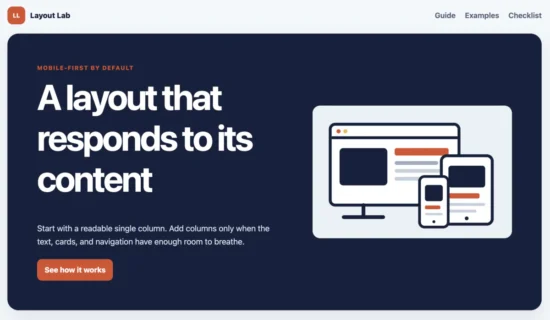
<img
    src="images/responsive-workspace.svg"
    alt="A website preview shown at phone, tablet, and desktop sizes"
    width="960"
    height="640">
The width and height attributes do not stop the CSS from resizing the image. They give the browser its aspect ratio before the file finishes loading, so space can be reserved and the surrounding content is less likely to shift.
The demo uses SVG because the illustration remains sharp at different sizes. For photographs, the same fluid CSS still applies, but production pages may also use srcset and sizes to avoid sending an unnecessarily large image to a narrow screen.
The MDN guide to responsive images in HTML explains how browsers use srcset, sizes, and <picture> to select suitable image sources.
This responsive image gallery using CSS media queries shows how responsive sizing can be applied across a group of images.
Scale spacing and typography within safe limits
Responsive values do not always require breakpoints. The CSS clamp() function can scale a value with the viewport while enforcing a minimum and maximum.
.hero {
    gap: clamp(1.5rem, 4vw, 3.5rem);
    padding: clamp(1.5rem, 5vw, 4rem);
}

h1 {
    max-width: 14ch;
    font-size: clamp(2.2rem, 8vw, 4.8rem);
    letter-spacing: -0.045em;
}
For the heading, the preferred value grows with the viewport, but it never becomes smaller than 2.2rem or larger than 4.8rem. The max-width measured in characters keeps the line length intentional.
Fluid values are most useful when they improve the transition between layouts. They should still have limits. An unrestricted viewport unit can produce text that is tiny on a phone or comically large on an ultrawide monitor.
Respect user preferences
Responsive design is not limited to screen width. Media queries can also respond to user preferences and input characteristics.
The demo uses smooth scrolling for in-page links, then disables that animation when the user has requested reduced motion:
html {
    scroll-behavior: smooth;
}

@media (prefers-reduced-motion: reduce) {
    html {
        scroll-behavior: auto;
    }
}
This media query does not rearrange the layout, but it adapts the experience to the reader. Similar queries can respond to color-scheme preferences, contrast preferences, hover support, or pointer accuracy when the design genuinely needs them.
Keep responsive CSS focused
A responsive stylesheet does not need a separate block for every familiar device width. Start with flexible rules, resize the page, and add a breakpoint only where the content stops working well.
This approach has two useful effects. The stylesheet contains fewer overrides, and the layout is more likely to survive screen sizes that were not part of the original test list. New phones appear every year. Content needs are usually more stable.
Common responsive design mistakes
Using fixed page widths
A fixed width such as width: 1200px forces narrow viewports to scroll horizontally. Prefer a fluid width with a sensible maximum:
.page {
    width: min(100% - 2rem, 72rem);
    margin-inline: auto;
}
Choosing breakpoints by device name
Labels such as phone, tablet, and desktop are convenient when discussing a design, but they are unreliable foundations for CSS. Device sizes overlap, browser windows can be resized, and split-screen modes reduce the available width.
Resize the layout until its content becomes cramped or leaves too much empty space. Add the breakpoint there.
Disabling browser zoom
Do not use viewport settings such as user-scalable=no. They can prevent readers from enlarging content. A responsive page should adapt to zoom rather than block it.
Hiding important content on small screens
Removing a sidebar or navigation control with display: none may make the layout fit, but it can also remove functionality. Stack important content, simplify its presentation, or provide an accessible alternative instead of hiding it automatically.
Fixing one overflow while missing another
Images are common causes of horizontal scrolling, but they are not the only ones. Long URLs, unbroken text, tables, preformatted code, and grid children with large minimum sizes can also overflow.
For tabular data, a responsive table with automatic column hiding can prioritize essential columns when space becomes limited.
Do not apply overflow-x: hidden to the entire page as the first fix. That hides the symptom and can make clipped content inaccessible. Inspect the element that is wider than the viewport and correct its sizing.
Test the responsive layout
Drag the browser window slowly instead of checking only a few preset device sizes. This exposes awkward widths between common presets, which is often where layout problems hide.
For the demo, verify the following:
- At a narrow width, the header, hero, article, cards, and checklist appear in a readable order.
- The page has no horizontal scrollbar.
- The illustration scales within the hero without changing its aspect ratio.
- The navigation wraps instead of extending beyond the viewport.
- Just below
48rem, the main content remains in one column. - At
48remand above, the hero and article area form two readable columns. - At a wide width, text lines remain comfortable because the page has a maximum width.
- Keyboard focus remains visible and browser zoom does not break the layout.
Browser responsive-design tools are useful, but test on at least one real phone when the page is intended for production. A real device can reveal touch, font rendering, browser interface, and performance issues that a resized desktop window does not reproduce.
Download the responsive web design example
The example project contains four source files and requires no framework, build process, PHP runtime, or database. Open index.html directly or follow the local server instructions in README.md.
Download the responsive web design demo ZIP
The project brings the complete approach together: semantic HTML, a mobile-first layout, Flexbox navigation, CSS Grid columns, a fluid image, and a breakpoint based on the space required by the content.




thanx alot for dis new update…. realy it works….. :)
Welcome Kirti
Thanks so much it help me solve my problems
Welcome Abdul.
This is what i was looing for. Thank you for sharing this tutorial.
Welcome Prabakaran.
Thanks again for your assistance!
Welcome James.