This article has HTML templates for contact form pages. All these templates are responsive to fit any viewports.
On a responsive page, the site header menu can be toggled. Template 1 and 2 of this example has JavaScript function to perform the toggle events for a sliding menu in the mobile view. Check this tutorial if you are looking for a PHP contact form.
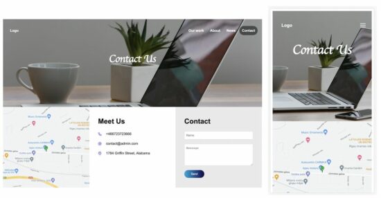
Contact Form Template 1
This template has the contact form in the site footer. The footer contains three columns to show the contact form details.
If you are creating a contact form page, it should clearly show the location and the contact details.
In this template, the footer columns show these details with a contact form.
The site header contains menu links and a hamburger icon. The hamburger icon can be seen in the mobile view only.
The header dropdown menu will be shown on clicking that icon in the site banner.
template-1/index.html
<html>
<head>
<meta name="viewport" content="width=device-width, initial-scale=1">
<link href="style.css" rel="stylesheet" type="text/css">
</head>
<body>
	<div class="container">
		<div class="site-banner">
			<div class="header-menu">
				<a href="">Logo</a>
				<span id="menu-icon" onClick="toggleMenu()"><img src="images/menu.svg" /></span>
				<span id="header-right-menu">
					<a href="#">Our work</a>
					<a href="#">About</a>
					<a href="#">News</a>
					<a href="#" class="header-active">Contact</a>
				</span>
			</div>
			<h1 class="heading">Contact Us</h1>
		</div><div class="footer">
			<div class="footer-column"><img class="map-image" src="images/location.jpg" /></div>
			<div class="footer-column">
				<div class="tile-content">
					<h1>Meet Us</h1>
					<div class="contact-row">
						<img src="images/phone.svg"><span class="tile-field">+466723723666</span>
					</div>
					<div class="contact-row">
						<img src="images/at-sign.svg"><span class="tile-field">contact@admin.com</span>
					</div>
					<div class="contact-row">
						<img src="images/map-pin.svg"><span class="tile-field">1784 Griffin Street, Alabama</span>
					</div>
				</div>
			</div>
			<div class="footer-column contact-form-container">
				<div class="tile-content">
					<form method="POST">
						<h1>Contact</h1>
						<div class="contact-row">
							<input type="text" class="form-field" placeholder="Name">
						</div>
						<div class="contact-row">
							<textarea rows="5" class="form-field" placeholder="Message"></textarea>
						</div>
						<button class="button">Send</button>
					</form>
				</div>
			</div>
		</div>
	</div>

	<script>
		function toggleMenu() {
			var menuElement = document.getElementById("header-right-menu");
			if (menuElement.style.display === "block") {
				menuElement.style.display = "none";
			} else {
				menuElement.style.display = "block";
			}
		}
	</script>
</body>
</html>
The below CSS is created for this contact form template. It contains media queries for the responsiveness of the contact form page.
template-1/style.css
body {
	font-family: Arial;
}

.container {
	max-width: 1180px;
	margin: 0 auto;
	line-height: 1.5;
}
/*  header style starts */
.site-banner {
	min-height: 400px;
	background-image: url('images/header-image.jpg');
	background-size: cover;
	background-position: center;
	color: #ffffff;
}

.site-banner a {
	color: #ffffff;
	text-decoration: none;
	font-weight: bold;
	padding: 12px;
}

.header-menu {
	padding: 40px 20px;
}

#header-right-menu {
	float: right;
}

.header-active {
	background: rgba(0, 0, 0, 0.5);
    border-radius: 25px;
}

.heading {
	color: #ffffff;
	text-align: center;
	font-family: cursive;
	padding: 40px 0px;
	font-size: 3em;
	margin: 0px;
}
/*  header style ends */

.footer {
	display: flex;
}

.footer-column {
	width: 33.3%;
	float: left;
}

.map-image {
	width: 100%;
}

.contact-form-container {
	background-color: #eaeaea;
}

img {
	vertical-align: middle;
}

.tile-content {
	padding: 20px 40px;
}

.tile-content .contact-row {
	margin-bottom: 20px;
}

.tile-field {
	margin-left: 20px;
}

.form-field {
	width: 100%;
	padding: 10px 8px;
    border-radius: 4px;
    border: #d9d8d8 1px solid;
}

.button {
	color: #ffffff;
	padding: 10px 30px 10px 30px;
	border-radius: 20px;
	background: linear-gradient(to right, #08a9df, #12054a);
	border: 0px;
}

#menu-icon {
	display: none;
	float: right;
}

@media screen and (max-width: 1000px) {
	.footer-column {
		width: 50%;
	}
	.contact-form-container {
		width: 100%;
	}
	.footer {
		display: block;
	}
}

@media screen and (max-width: 540px) {
	#header-right-menu {
		float: none;
		display: none;
	}
	#header-right-menu a {
		display: block;
	}
	.heading {
		padding: 0px;
	}
	.tile-content {
    	padding: 0px 20px;
	}

	.footer-column {
		width: 100%;
	}

	#menu-icon {
		display: block;
		float: right;
	}
}
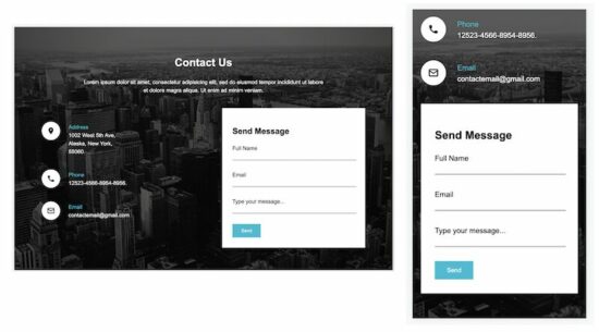
Contact Form Template 2
This contact template shows the contact details, address, phone, and email. It offers a form with primary fields to let the user communicate with the site owner.
This template has two columns in the site content area. The contact details and the contact form are shown in these two columns, respectively.
template-2/index.html
<!DOCTYPE html>
<html>
<head>
<title>Contact - Form</title>
<meta name="viewport" content="width=device-width, initial-scale=1">
<link rel="stylesheet" type="text/css" href="style.css">
</head>
<body>
	<div class="container">
		<div class="text-center">
			<h1>Contact Us</h1>
			<div>
				Lorem ipsum dolor sit amet, consectetur adipisicing elit, sed do
				eiusmod tempor incididunt ut labore <div>et dolore magra aliqua.
				Ut enim ad minim veniam.</div>
			</div>
		</div>
		<div class="content">
			<div class="col-1">
				<div class="address-line">
					<img alt="location" src="image/marker.png" class="icon">
					<div class="contact-info">
						<div class="contact-info-title">Address</div>
						<div>1002 West 5th Ave,</div>
						<div>Alaska, New York,</div>
						<div>55060.</div>
					</div>
				</div>
				<div class="address-line">
					<img alt="location" src="image/phone.png" class="icon">
					<div class="contact-info">
						<div class="contact-info-title">Phone</div>
						<div>12523-4566-8954-8956.</div>
					</div>
				</div>
				<div class="address-line">
					<img alt="location" src="image/mail.png" class="icon">
					<div class="contact-info">
						<div class="contact-info-title">Email</div>
						<div>contactemail@gmail.com</div>
					</div>
				</div>
			</div>
			<div class="col-2">
				<form>
					<div class="form-container">
						<h2>Send Message</h2>
						<div class="form-row">
							<label>Full Name</label>
							<div>
								<input type="text" class="form-field">
							</div>
						</div>
						<div class="form-row">
							<label>Email</label>
							<div>
								<input type="text" class="form-field">
							</div>
						</div>
						<div class="form-row">
							<label>Type your message...</label>
							<div>
								<input type="text" class="form-field">
							</div>
						</div>
						<input type="button" class="send-btn" value="Send">
					</div>
				</form>
			</div>
		</div>
	</div>
</body>
</html>
See the below CSS and include it in the template 2 HTML.
template-2/style.css
body {
	font-family: Arial;
	background-image: url('image/bg.jpg');
	background-size: cover;
	background-position: center;
	background-repeat: no-repeat;
	background-attachment: fixed;
}

.container {
	width: 950px;
	margin: 80px auto;
	color: white;
	line-height: 1.5;
}

.text-center {
	text-align: center;
}

.content {
	display: flex;
	margin-top: 40px;
}

.icon {
	background-color: white;
	border-radius: 30px;
	padding: 15px;
	vertical-align: top;
}

.contact-info {
	display: inline-block;
	padding: 4px 20px 0px 20px;
}

.address-line {
	margin-top: 40px;
}

.col-1 {
	width: 530px;
}

.col-2 {
	flex: 1 1 auto;
	background-color: white;
}

.form-container {
	color: #000;
	padding: 30px;
}

.contact-info-title {
	color: #01bdd4;
}

.form-row {
	padding-bottom: 30px;
}

.form-field {
	width: 100%;
	border: none;
	border-bottom: 1px solid #000;
}

.send-btn {
	border: 0px;
	padding: 12px 26px;
	background-color: #01bdd4;
	color: white;
}

@media all and (max-width: 1024px) {
	.container {
		width: auto;
		padding: 30px;
	}
	 .col-1 {
		width: 360px;
	}
}

@media all and (max-width: 700px) {
	.content {
		display: block;
	}
	.col-2 {
		margin-top: 40px;
	}
	.col-1{
	width:100%;
	}
}

@media all and (max-width: 500px) {
	.container {
		padding: 10px;
	}
}
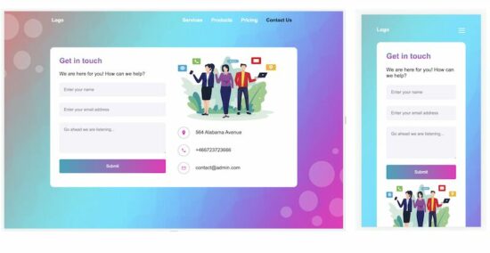
Contact Form Template 3
Template 3 is a simple and clean theme for a contact form page. It displays a contact form with a few primary fields. Also, it shows only the vital contact details on the page.
A simple contact template will encourage the end user to connect with you and increase the conversion rate.
template-3/index.html
<html>

<head>
	<meta name="viewport" content="width=device-width, initial-scale=1">
	<link href="style.css" rel="stylesheet" type="text/css">
</head>

<body>
	<div class="container">
		<div class="header-content">
			<a href="">Logo</a>
			<span id="menu-icon" onClick="toggleMenu()"><img src="images/menu.svg" /></span>
			<span id="header-right-menu">
				<a href="#">Services</a>
				<a href="#">Products</a>
				<a href="#">Pricing</a>
				<a href="#" class="header-active">Contact Us</a>
			</span>
		</div>
		<div class="inner-container">
			<div class="tile1">
				<div class="tile1-heading">Get in touch</div>
				<div class="form-row">We are here for you! How can we help?</div>
				<form>
					<div class="form-row">
						<input type="text" class="form-field" placeholder="Enter your name">
					</div>
					<div class="form-row">
						<input type="text" class="form-field" placeholder="Enter your email address">
					</div>
					<div class="form-row">
						<textarea class="form-field" placeholder="Go ahead we are listening..."></textarea>
					</div>
					<div class="form-row">
						<input type="button" class="form-field btn" value="Submit">
					</div>
				</form>
			</div>
			<div class="tile2">
				<div class="tile2-image">
					<img src="images/contact.png">
				</div>
				<div>
					<div class="form-row">
						<img src="images/loaction.png" class="contact-image"><span>564
							Alabama Avenue</span>
					</div>
					<div class="form-row">
						<img src="images/phone.png" class="contact-image"><span>+466723723666</span>
					</div>
					<div class="form-row">
						<img src="images/mail.png" class="contact-image"><span>contact@admin.com</span>
					</div>
				</div>
			</div>
		</div>
	</div>

	<script>
		function toggleMenu() {
			var menuElement = document.getElementById("header-right-menu");
			if (menuElement.style.display === "block") {
				menuElement.style.display = "none";
			} else {
				menuElement.style.display = "block";
			}
		}
	</script>

</body>

</html>
And the styles of this template three are shown below.
template-3/style.css
body {
	font-family: Arial;
	background-image: url('images/bg.jpg');
	background-position: center;
	background-size: cover;
	background-repeat: no-repeat;
	background-attachment: fixed;
}

.container {
	border-radius: 16px;
	max-width: 1180px;
	margin: 0 30px;
}

a {
	color: #ffffff;
	text-decoration: none;
}

.header-content {
	font-weight: bold;
	width: 800px;
	margin: 20px auto;
}

#header-right-menu {
	float: right;
}

#header-right-menu a {
	padding: 12px;
}

.header-active{
	color:#000;
}

.inner-container {
	width: 750px;
	margin: 80px auto;
	display: flex;
	background-color: white;
	border-radius: 12px;
	padding: 30px
}

.tile1 {
	width: 350px;
}

.tile2 {
	flex: 1 1 auto;
	padding: 0px 40px;
}

.tile1-heading {
	background: -webkit-linear-gradient(#0aa6bd, #f126bd);
	-webkit-background-clip: text;
	-webkit-text-fill-color: transparent;
	font-weight: bold;
	font-size: 1.5em;
}

.form-row {
	padding: 20px 0px 0px 0px;
}

.form-field {
	border-radius: 4px;
	width: 100%;
	padding: 15px;
	background-color: #f5f4fa;
	border: 0px;
}

.contact-image {
	padding: 10px;
	border-radius: 35px;
	border: 1px solid #a8a4a4;
	vertical-align: middle;
	margin-right: 20px;
	width: 16px;
	height: 16px;
}

textarea {
	height: 100px;
	font-family: Arial;
}

.btn {
	color: white;
	background: linear-gradient(to right, #0aa6bd, #f126bd);
}

.tile2-image img {
	width: 321px;
	height: 211px;
}

#menu-icon {
	display: none;
	float: right;
}

@media all and (max-width: 900px) {
	.inner-container {
		width: auto;
		display: block;
		margin: 30px auto;
	}
	.header-content {
		width: auto;
	}
	.tile1 {
		width: 100%;
	}
	.tile2 {
		padding: 0px;
	}
	.tile2-image img {
		width: 100%;
		height: auto;
	}
}

@media all and (max-width: 540px) {
	#header-right-menu {
		float: none;
		display: none;
	}
	#header-right-menu a {
		display: block;
		padding: 10px 0px;
	}

	#menu-icon {
		display: block;
		float: right;
	}
}

@media all and (max-width: 400px) {
	.container {
		padding: 10px;
	}
}