If you are looking for a client-side solution to detect a mobile device, your search stops here :-). There are properties to detect this on the client side by using JavaScript.
Two methods of detecting whether a current device is mobile are listed below.
- By using JavaScript window.matchMedia() method.
- By using a navigator.userAgent property.
Both use basic JavaScript methods to create the mobile device detector code.
1) By using JavaScript window.matchMedia() method
This method is the best compared to the one using JavaScript navigator.userAgent. Because the userAgent is a setting that the end users can configure. They can change it!
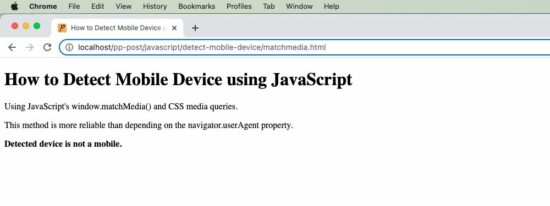
matchmedia.html
Quick example
function isMobileDevice() {
	return window
		.matchMedia("only screen and (max-width: 760px)").matches;
}
if (isMobileDevice()) {
	document.write("<b>Detected device is a mobile.</b>");
} else {
	document
		.write("<b>Detected device is not a mobile.</b>");
}
This mobile device detection uses the matchMedia() JavaScript custom method.
It accepts a media query string and returns an object. This object will contain the current device’s media property and its relevancy.
Then, this object is used to find the match between the current device’s media property with the media query passed.
This program sends the media query containing a max-width of a mobile device that is expected to have.
If the current device’s media screen properties match this argument, then this JavaScript function returns a boolean true.
This screenshot from my computer prints the result of the above quick example.
Media match with CSS
It can also be done by CSS instead of JavaScript. Follow the below steps to implement this using CSS.
- Keep two possible messages in the HTML markup with style=’display:none’.
- Write CSS media query section with @media screen and (max-width: 600px).
- Show and hide the appropriate UI notification element according to the screen width.
<!DOCTYPE html>
<html>
<head>
<title>How to Detect Mobile Device using JavaScript</title>
<meta name="viewport" content="width=device-width, initial-scale=1">
<style>
.mobile {
    display: none;
}

.not-mobile {
    display: block;
}

@media only screen and (max-width: 600px) {
    .mobile {
        display: block;
    }
    .not-mobile {
        display: none;
    }
}
</style>
</head>
<body>
    <b class="mobile">Detected device is a mobile.</b>
    <b class="not-mobile">Detected device is not a mobile.</b>
</body>
</html>
2) By using a navigator.userAgent property
The alternate method is to check the current userAgent to detect if it is a mobile device.
The isMobileDevice() function in the below example does the test with a regex pattern. The regex contains the possible values of a mobile device’s userAgent.
We have already used regex pattern matching for a JavaScript email validation utility.
The script compares the current device’s userAgent property with the pattern. If a match is found, then this function returns true to print the appropriate result.
navigator.html
<!DOCTYPE html>
<html>
<head>
<title>How to Detect Mobile Device using JavaScript</title>
</head>
<body>
    <h1>How to Detect Mobile Device using JavaScript</h1>
    <p>Note: Browser users can change value of "userAgent" via UA
        spoofing. So be aware of that and do not use this feature to
        provide a critical function of your website.</p>
    <script>
		function isMobileDevice() {
			return /Android|webOS|iPhone|iPad|iPod|BlackBerry|IEMobile|Opera Mini/i
					.test(navigator.userAgent);

			/* for a more detailed test
			/(android|bb\d+|meego).+mobile|avantgo|bada\/|blackberry|blazer|compal|elaine|fennec|hiptop|iemobile|ip(hone|od)|ipad|iris|kindle|Android|Silk|lge |maemo|midp|mmp|netfront|opera m(ob|in)i|palm( os)?|phone|p(ixi|re)\/|plucker|pocket|psp|series(4|6)0|symbian|treo|up\.(browser|link)|vodafone|wap|windows (ce|phone)|xda|xiino/i
					.test(navigator.userAgent)
					|| /1207|6310|6590|3gso|4thp|50[1-6]i|770s|802s|a wa|abac|ac(er|oo|s\-)|ai(ko|rn)|al(av|ca|co)|amoi|an(ex|ny|yw)|aptu|ar(ch|go)|as(te|us)|attw|au(di|\-m|r |s )|avan|be(ck|ll|nq)|bi(lb|rd)|bl(ac|az)|br(e|v)w|bumb|bw\-(n|u)|c55\/|capi|ccwa|cdm\-|cell|chtm|cldc|cmd\-|co(mp|nd)|craw|da(it|ll|ng)|dbte|dc\-s|devi|dica|dmob|do(c|p)o|ds(12|\-d)|el(49|ai)|em(l2|ul)|er(ic|k0)|esl8|ez([4-7]0|os|wa|ze)|fetc|fly(\-|_)|g1 u|g560|gene|gf\-5|g\-mo|go(\.w|od)|gr(ad|un)|haie|hcit|hd\-(m|p|t)|hei\-|hi(pt|ta)|hp( i|ip)|hs\-c|ht(c(\-| |_|a|g|p|s|t)|tp)|hu(aw|tc)|i\-(20|go|ma)|i230|iac( |\-|\/)|ibro|idea|ig01|ikom|im1k|inno|ipaq|iris|ja(t|v)a|jbro|jemu|jigs|kddi|keji|kgt( |\/)|klon|kpt |kwc\-|kyo(c|k)|le(no|xi)|lg( g|\/(k|l|u)|50|54|\-[a-w])|libw|lynx|m1\-w|m3ga|m50\/|ma(te|ui|xo)|mc(01|21|ca)|m\-cr|me(rc|ri)|mi(o8|oa|ts)|mmef|mo(01|02|bi|de|do|t(\-| |o|v)|zz)|mt(50|p1|v )|mwbp|mywa|n10[0-2]|n20[2-3]|n30(0|2)|n50(0|2|5)|n7(0(0|1)|10)|ne((c|m)\-|on|tf|wf|wg|wt)|nok(6|i)|nzph|o2im|op(ti|wv)|oran|owg1|p800|pan(a|d|t)|pdxg|pg(13|\-([1-8]|c))|phil|pire|pl(ay|uc)|pn\-2|po(ck|rt|se)|prox|psio|pt\-g|qa\-a|qc(07|12|21|32|60|\-[2-7]|i\-)|qtek|r380|r600|raks|rim9|ro(ve|zo)|s55\/|sa(ge|ma|mm|ms|ny|va)|sc(01|h\-|oo|p\-)|sdk\/|se(c(\-|0|1)|47|mc|nd|ri)|sgh\-|shar|sie(\-|m)|sk\-0|sl(45|id)|sm(al|ar|b3|it|t5)|so(ft|ny)|sp(01|h\-|v\-|v )|sy(01|mb)|t2(18|50)|t6(00|10|18)|ta(gt|lk)|tcl\-|tdg\-|tel(i|m)|tim\-|t\-mo|to(pl|sh)|ts(70|m\-|m3|m5)|tx\-9|up(\.b|g1|si)|utst|v400|v750|veri|vi(rg|te)|vk(40|5[0-3]|\-v)|vm40|voda|vulc|vx(52|53|60|61|70|80|81|83|85|98)|w3c(\-| )|webc|whit|wi(g |nc|nw)|wmlb|wonu|x700|yas\-|your|zeto|zte\-/i
							.test(navigator.userAgent.substr(0, 4))
			 */
		}

		if (isMobileDevice()) {
			document.write("<b>Detected device is a mobile.</b>");
		} else {
			document
					.write("<b>Detected device is not a mobile.</b>");
		}
	</script>
</body>
</html>
Note: Browser users can change the value of “userAgent” via UA spoofing. So be aware of that and do not use this feature to provide a critical function of your website.